
COSG: marker genes and their significance
COSG ranks a gene for a cell group by the cosine similarity between the gene’s expression across cells and an indicator for that group. That answers how specific a gene is. Since v1.2.0 it also answers how surprising the specificity is, with analytic p-values. This page does both on one dataset, and then shows the one way of using them that is wrong.
1. The data
The adult mouse cortex Multiome RNA object: 17,412 cells, 26,205 genes, 20 annotated cell types across 5 batches.
import numpy as npimport pandas as pdimport piaso, cosg
piaso.settings.set_figure_params()
adata = piaso.data.load_dataset("adult_cortex_multiome_rna")adata.X = adata.layers["log1p"].copy()      # X is scaled; COSG wants non-negativeadata.shape, adata.obs["CellTypes"].nunique()
((17412, 26205), 20)The cell types are very unevenly sized, which matters later — Oligodendrocyte has 4,451 cells and Endothelial has 41.
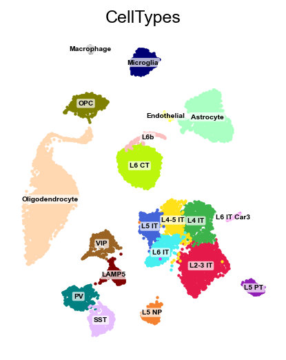
piaso.pl.embedding(adata, color="CellTypes", basis="X_umap", legend_loc="both", legend_fontsize=6, legend_fontbackground="0.9", legend_fontbackground_alpha=0.85)legend_loc="both" draws the labels on the clusters and keeps the colour key
at the side — worth it here because two categories (Macrophage, Endothelial)
are too small to carry a readable label. legend_fontbackground is the patch
behind each on-data label: the default white is readable over a cluster and
invisible over the figure background, which is exactly where a small cluster’s
label ends up, so a light grey makes every label legible in both places. Pass
None for no patch.
2. Running COSG
cosg.cosg(adata, groupby="CellTypes", key_added="cosg", mu=100, expressed_pct=0.1, remove_lowly_expressed=True, n_genes_user=50, calculate_pvalues=True) # default FalseEight seconds. Three parameters do the work:
mupenalises a gene that is also high in other groups.mu=1is permissive and returns genes that are high in this group whether or not they are high elsewhere;mu=100is strict and returns genes that are close to exclusive. It changes the ranking, not the biology.expressed_pct=0.1withremove_lowly_expressed=Truedrops genes detected in under 10% of the group’s cells, which otherwise reach high cosine from a handful of cells.n_genes_useris how many markers to report per group.
The result is a table per group:
pd.DataFrame(adata.uns["cosg"]["names"]).head(3)The full set of columns, with calculate_pvalues=True:
sorted(adata.uns["cosg"].keys())['COSG', 'names', 'neg_log10_pvals', 'params', 'pvals', 'pvals_adj', 'scores', 'zscores']What comes back, and in which shape
cosg.cosg writes into adata.uns[key_added] and returns nothing. Two
arguments control what lands there:
return_by_group=True(default) additionally storesadata.uns['cosg']['COSG']— one wide DataFrame whose columns areattribute::cell_group(names::Astrocyte,scores::Astrocyte, …), joined bycolumn_delimiter. This is the formindexByGeneconsumes, and it is a second copy of the results; passreturn_by_group=Falseif you only want the per-attribute arrays and care about memory.copy=Truereturns a modified copy instead of writing in place.
Each per-attribute entry (names, scores, pvals, …) is a structured array
with one field per cell group, which is why pd.DataFrame(...) on it gives a
cell-type-per-column table. On the streaming path
run_cosg_cytome there is no AnnData, so it
returns its results and output_format chooses the shape.
For L2-3 IT neurons, the top five:
| gene | scores | pvals | neg_log10_pvals | zscores |
|---|---|---|---|---|
| Otof | 0.282 | 2.23e-308 | 725.2 | 57.7 |
| Ccbe1 | 0.060 | 2.23e-308 | 1070.5 | 70.1 |
| Evc2 | 0.026 | 2.23e-308 | 496.2 | 47.7 |
| B230216N24Rik | 0.022 | 2.23e-308 | 847.1 | 62.4 |
| Efcab1 | 0.017 | 5.68e-223 | 222.2 | 31.9 |
Notice the first four pvals are the same number. That is not a tie — see §4.
3. Looking at the markers
cosg.plotMarkerDotplot(adata, groupby="CellTypes", top_n_genes=2, use_rep="X_umap", key_cosg="cosg")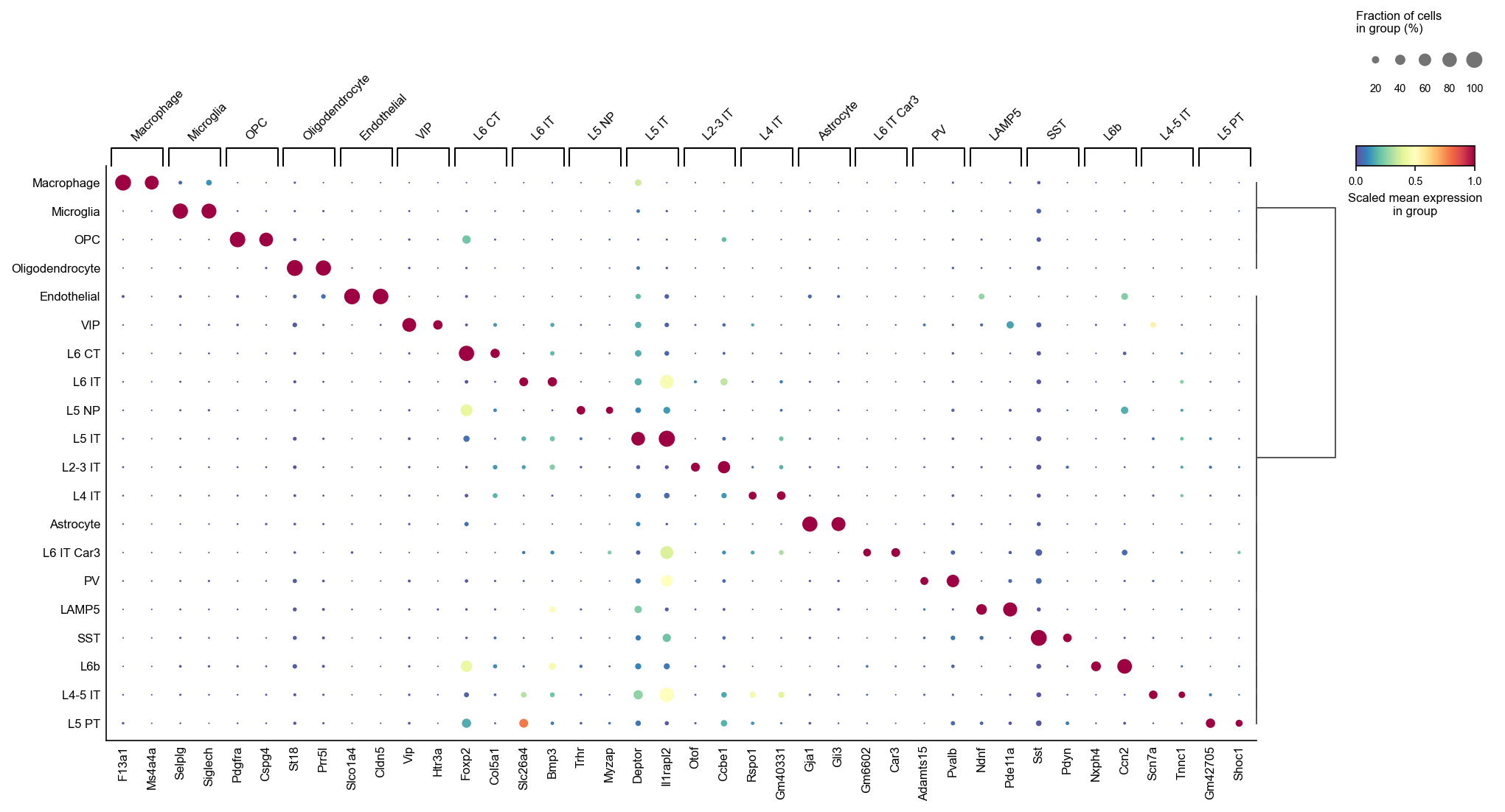
The diagonal is the point: each cell type’s markers are expressed in that type
and close to nowhere else. use_rep orders the cell types by their position in
the embedding, so related types sit together, and the dendrogram on the right
is the tree that ordering came from.
swap_axes=True transposes it, which is the better shape when you have more
cell types than fit across a page:
cosg.plotMarkerDotplot(adata, groupby="CellTypes", top_n_genes=2, use_rep="X_umap", key_cosg="cosg", swap_axes=True)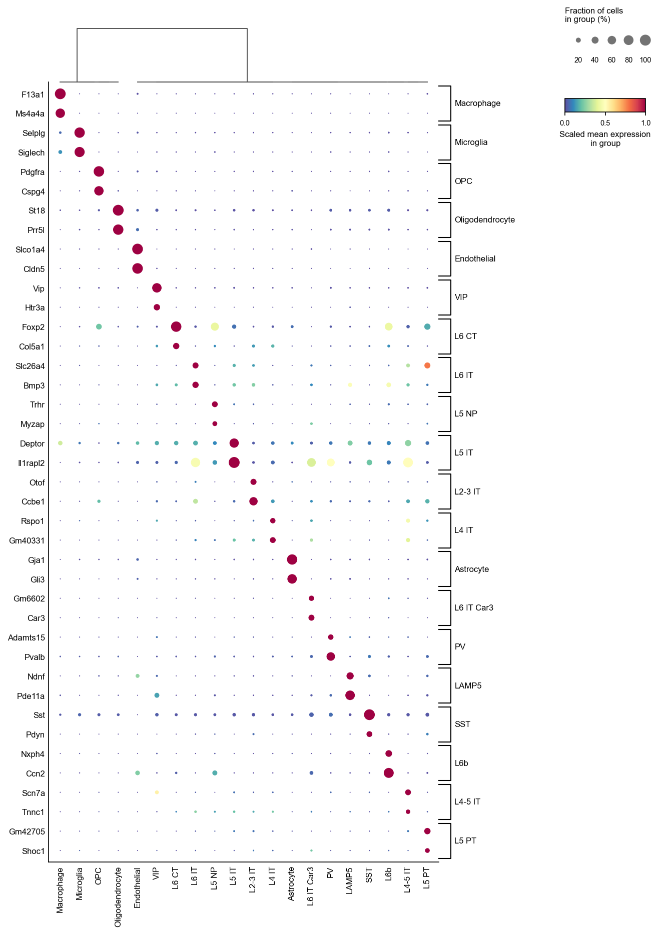
The function returns the dot grid’s Axes, so you can keep drawing on it, and
save= takes a path. Both differ from sc.pl.dotplot, which COSG used to call
— see what changed.
plotMarkerDendrogram asks a different question — which cell types share
marker structure — by clustering the cell types on their COSG scores and
hanging each type’s top genes off its leaf.
cosg.plotMarkerDendrogram(adata, group_by="CellTypes", use_rep="X_umap", top_n_genes=3, cosg_key="cosg", figure_size=(11, 11))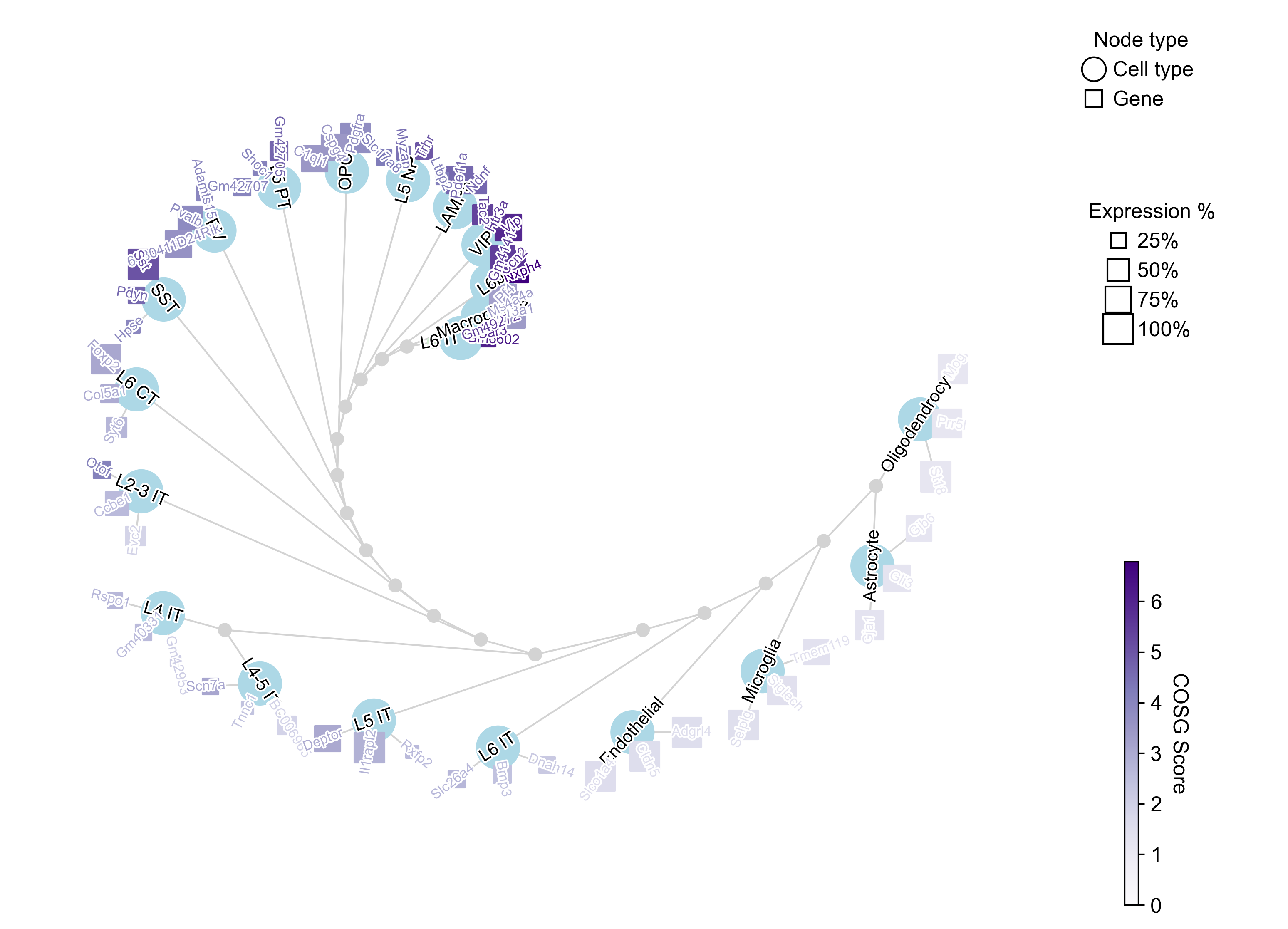
The excitatory layers group together and the glia sit apart, which is the expected structure and a quick check that the markers are not noise.
A note on the dot plot
plotMarkerDotplot draws its own layout rather than delegating to
sc.pl.dotplot, because two things could not be fixed through scanpy’s
arguments.
The group labels were being truncated. scanpy cuts a bracket label to
2 × (genes per group) characters when the brackets are on the right — which
is what swap_axes=True asks for. At top_n_genes=2 that is four characters,
so on this dataset L6 CT, L6 IT and L6 IT Car3 all rendered as L6 .,
and L5 IT / L5 NP / L5 PT as L5 .. The panel whose job is to say which
group each gene belongs to could not distinguish them.
The dendrogram was drawn on its own scale rather than in leaf coordinates, so it did not have to line up with the rows it labelled.
Two differences to know if you are updating existing code:
save=is a path. scanpy treats it as a filename suffix pasted afterfigures/dotplot_, so an absolute path used to raiseFileNotFoundError.- the function returns the Axes instead of
None.
backend="scanpy" restores the old call if you need it. Otherwise scanpy is no
longer required for anything in COSG.
Comparing scores across cell types: IQR normalisation
A raw COSG score is only meaningful within a cell type. Across types the scale differs wildly, because it depends on how many cells the type has and how exclusive its genes are. On this dataset the top score per cell type spans a 112-fold range: Macrophage peaks at 0.939 and L6 IT at 0.008.
That ordering is the warning. Macrophage is one of the smallest types here, and a gene expressed in most of its cells and almost nowhere else reaches a cosine near 1 precisely because the group is small. L6 IT is large and sits next to several related IT types, so no gene is close to exclusive to it. The raw score is ranking the cell types by how easy they are, not the genes by how good they are — so a colour scale or a threshold shared across types is measuring the type, not the gene.
iqrLogNormalize fixes that. For each cell type it computes an interquartile
range as quantile(q_upper) - quantile(q_lower) — by default the 0.95 and 0.75
quantiles, so the “spread” is taken over the informative upper tail rather than
the mass of near-zero genes — divides that column by its IQR, and applies
log1p. Each type is then measured in units of its own spread.
It needs scores for every gene, not just the top N, so run COSG once with
n_genes_user=adata.n_vars:
cosg.cosg(adata, groupby="CellTypes", key_added="cosg_all",          mu=100, n_genes_user=adata.n_vars)
scores = cosg.indexByGene(pd.DataFrame(adata.uns["cosg_all"]["COSG"]))normalized = cosg.iqrLogNormalize(scores, q_upper=0.95, q_lower=0.75)normalized.shape
(26205, 20)indexByGene reshapes the wide COSG table into genes × cell types;
iqrLogNormalize makes those columns comparable.
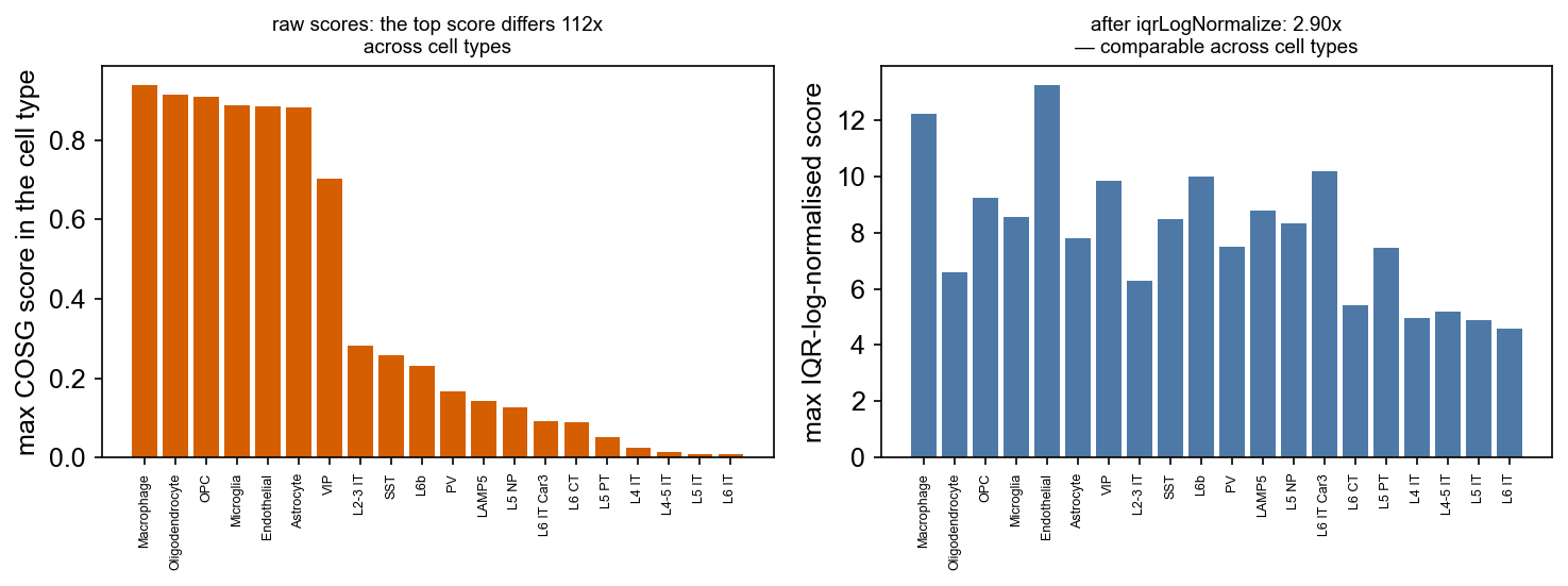
After normalisation the top score per type spans 2.9-fold instead of 112 —
Endothelial 13.26 at the top, L6 IT 4.58 at the bottom.
Use the normalised table whenever the comparison crosses cell types — a shared
heatmap, a dendrogram, a cross-type threshold. plotMarkerDendrogram does this
internally when calculate_dendrogram_on_cosg_scores=True, which is why that
option gives a tree about marker structure rather than about cell-type size.
Dendrogram variants
The tree above uses defaults. Five arguments change what it says.
What the tree is computed on. calculate_dendrogram_on_cosg_scores=False
clusters the cell types on their mean position in use_rep — the embedding’s
opinion of which types are similar:
cosg.plotMarkerDendrogram( adata, group_by="CellTypes", use_rep="X_umap", calculate_dendrogram_on_cosg_scores=False, top_n_genes=3, radius_step=1.5, cmap="Purples", gene_label_offset=0.25, gene_label_color="black", linkage_method="ward", distance_metric="correlation", hierarchy_merge_scale=0, add_cluster_node_for_single_node_cluster=True, figure_size=(10, 10), colorbar_width=0.01, gene_color_min=0,)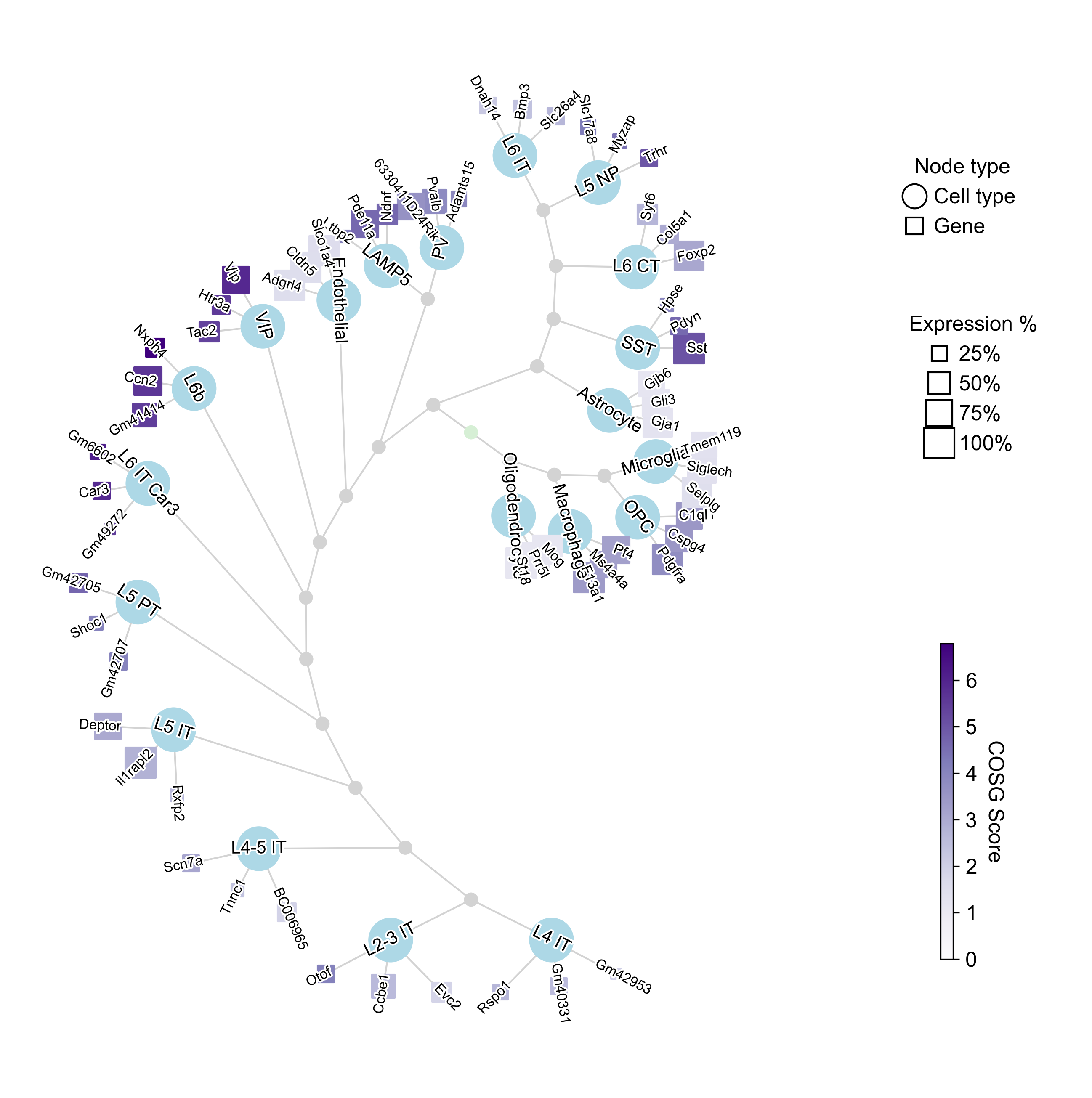
True instead clusters them on their IQR-normalised COSG scores — which types
share marker structure, a different and often more interpretable question:
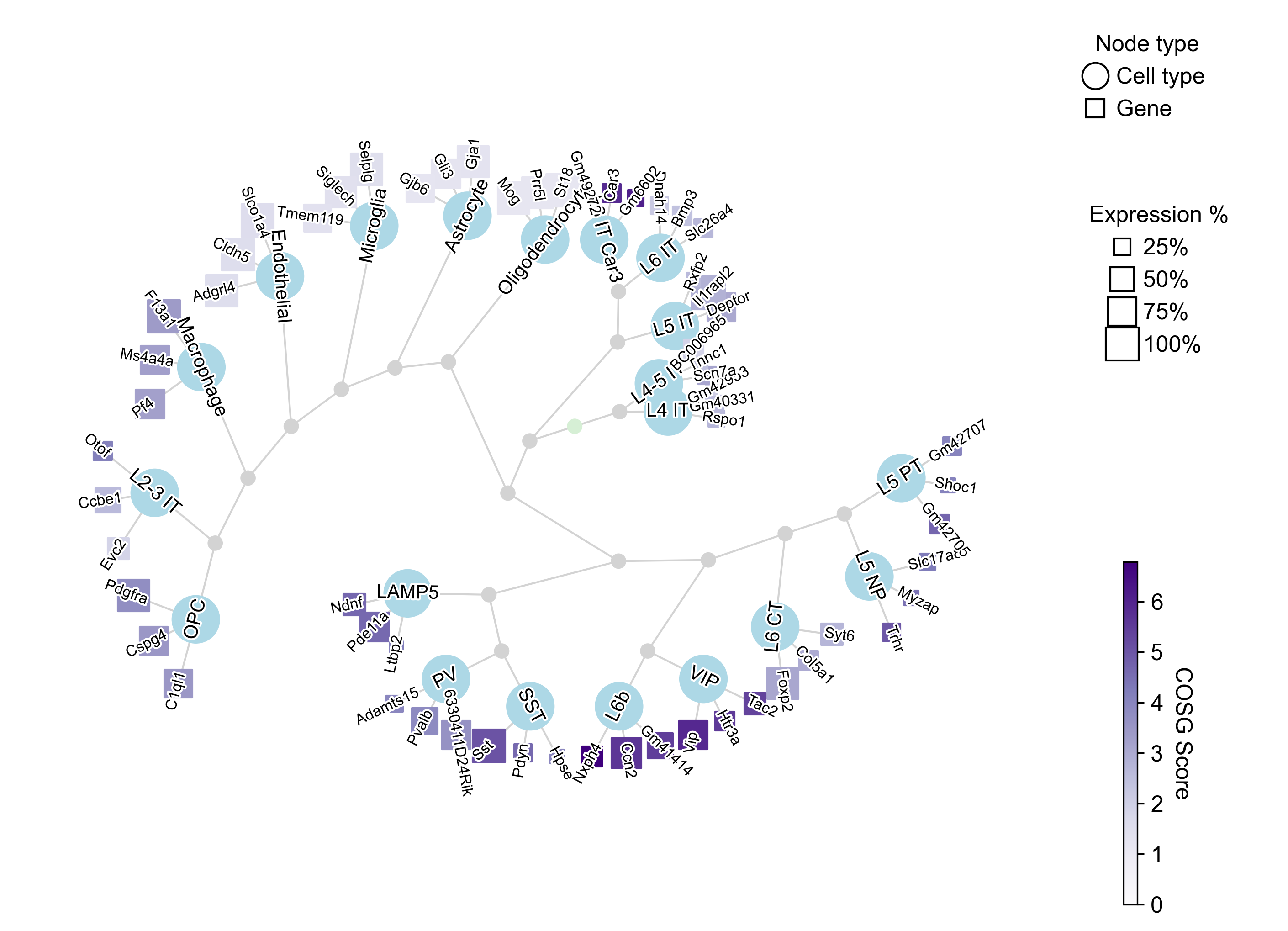
Collapsing the tree. collapse_scale between 0 and 1 merges shallow
internal nodes, trading detail for legibility:
cosg.plotMarkerDendrogram(..., calculate_dendrogram_on_cosg_scores=True, collapse_scale=0.2)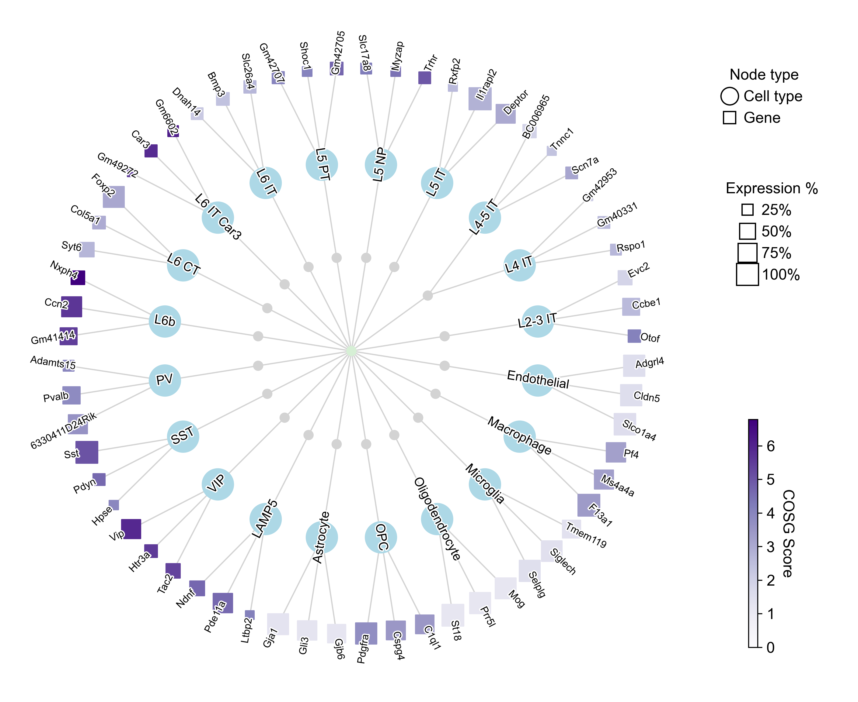
Node shapes. node_shape_cell_type and node_shape_gene take any
matplotlib marker ('o', 's', 'd', '^'), here with a stronger collapse:
cosg.plotMarkerDendrogram(..., collapse_scale=0.8, node_shape_cell_type="d", node_shape_gene="^")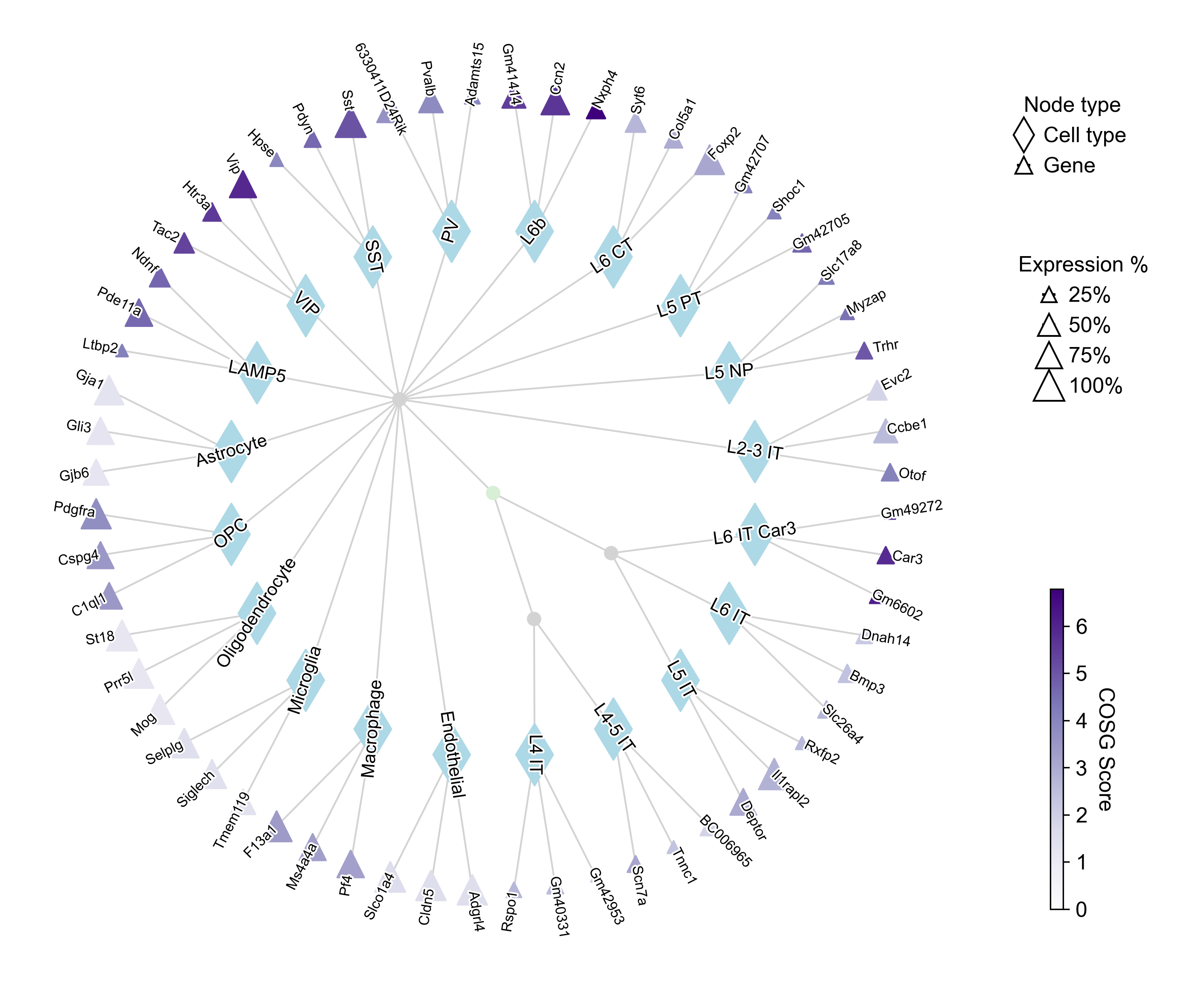
A subset, and curved edges. cell_type_selected restricts the plot to the
types you name — useful when 20 types is too many to read — and edge_curved
bends the edges:
cosg.plotMarkerDendrogram( adata, group_by="CellTypes", use_rep="X_umap", calculate_dendrogram_on_cosg_scores=True, top_n_genes=3, cell_type_selected=["PV", "SST", "VIP", "LAMP5", "L5 NP", "L6b", "L6 CT", "L2-3 IT"], cmap="Reds", collapse_scale=0.5, edge_curved=0.5, add_cluster_node_for_single_node_cluster=False, figure_size=(10, 10), colorbar_width=0.01, gene_color_min=0,)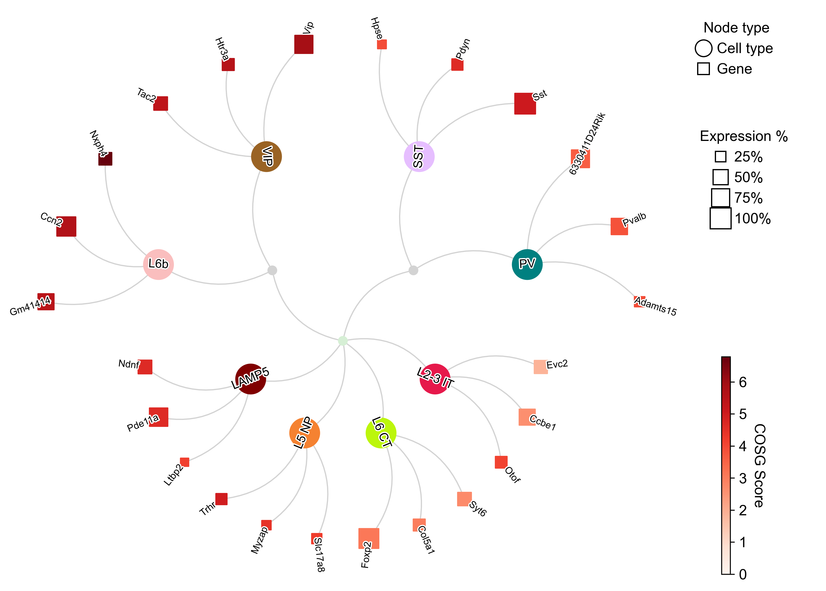
The interneuron markers come out canonical — Vip for VIP, Sst and Pdyn for SST,
Pvalb for PV, Ndnf for LAMP5 — which is the check worth doing on your own data
before trusting the rest of the table. Node area is the fraction of the cell
type expressing the gene; colour is the COSG score. map_cell_type_gene takes
an explicit {cell type: [genes]} mapping when you want to show chosen genes
rather than the top N.
4. Reading the significance columns
Four columns arrive together and answer different questions.
pvals is the probability, under the null that this gene’s expression is
independent of the grouping, of seeing a cosine at least this specific.
pvals_adj is that after Benjamini–Hochberg within each group, across every
gene tested in that group — before the top-50 selection, so the correction
divides by the size of the screen and not by the size of the list you asked
for.
zscores standardises the effect and is the right column for comparing genes
across cell types.
neg_log10_pvals exists because pvals runs out of room. Of the 1,000
gene × cell-type entries in this table, 598 (59.8%) sit exactly at the
float64 floor — for Microglia, Astrocyte and Oligodendrocyte, every one of
the top 50 does.
pvals = pd.DataFrame(adata.uns["cosg"]["pvals"])(pvals.values <= np.finfo(np.float64).tiny).sum(), pvals.size(598, 1000)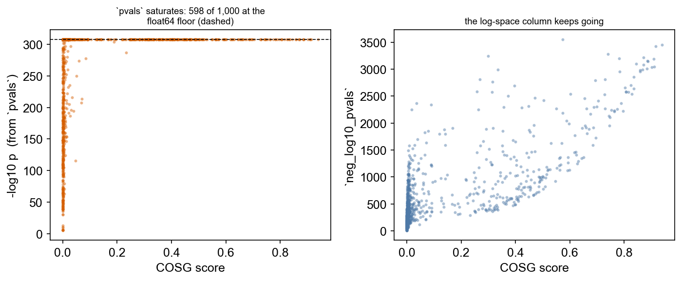
The left panel is what pvals can express: a ceiling. The right panel is the
same data through neg_log10_pvals, which is computed in log space and reaches
past 1,000. If you are ranking or plotting markers of a clean cell type, use
neg_log10_pvals or zscores; pvals cannot separate them.
Score, normalised score, evidence
Three columns can each be read as “how good is this marker”, and they are not the same question. Putting the score against the evidence, raw and IQR-normalised, shows what each one is actually measuring:
norm = cosg.iqrLogNormalize(cosg.indexByGene( pd.DataFrame(adata.uns["cosg_all"]["COSG"])))norm_top = pd.DataFrame({ct: norm.loc[names[ct].values, ct].values for ct in names.columns}) # the reported markers only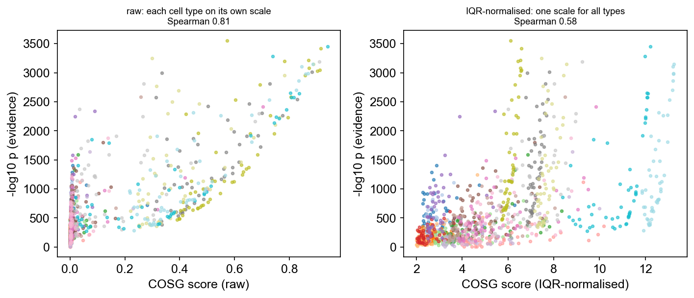
Spearman drops from 0.81 to 0.58 when the score is normalised, and that is
the informative part rather than a defect. Both the raw score and -log10 p
carry the same nuisance factor — a large, clean, well-separated cell type
produces high cosines and overwhelming evidence — so on the left they agree
partly because they are both reading cell-type size. IQR normalisation removes
that shared scale, and what is left is the honest relationship: a gene can be
highly specific with modest evidence (few cells express it) or strongly
evidenced with a middling score (many cells, less exclusive).
So the three columns divide up as:
| column | question | comparable across cell types? |
|---|---|---|
scores | how specific is this gene to this group | no — 112-fold scale difference |
| IQR-normalised score | how specific, in units of this group’s own spread | yes |
zscores | how far from chance, standardised | yes |
neg_log10_pvals | how much evidence against chance | yes, but scales with group size |
Use the raw score to rank within a cell type, the normalised score to compare
the same gene across types, and zscores or neg_log10_pvals when the
question is evidence rather than specificity.
5. Double dipping — the one way to get this wrong
If the group labels came from clustering the same expression matrix, the
p-values are anti-conservative. The labels were chosen to separate the data
they are then tested against. This is a property of the experimental design,
not of our approximation: it applies to scanpy.tl.rank_genes_groups in the
same situation, and computing a permutation null instead would not fix it.
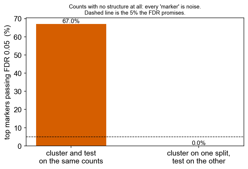
Here is what it costs, on data where the right answer is known. Counts are drawn from a Poisson with a per-gene rate and no cell-level structure at all — there are no groups to find, so every “marker” below is noise by construction.
import anndata as adimport scipy.sparse as spfrom sklearn.cluster import KMeans
rng = np.random.default_rng(0)rates = rng.gamma(0.4, 1.2, 2000)                       # per-gene, cell-independentcounts = sp.csr_matrix(rng.poisson(np.tile(rates, (3000, 1))).astype(np.float32))
Cluster it and test the same counts — what a standard workflow does:
def cluster_and_test(mat_for_labels, mat_for_test, key):    a = ad.AnnData(mat_for_labels.copy())    sc.pp.normalize_total(a, target_sum=1e4); sc.pp.log1p(a)    sc.pp.pca(a, n_comps=30)    a.obs["cl"] = pd.Categorical(        KMeans(n_clusters=3, n_init=10, random_state=0)        .fit_predict(a.obsm["X_pca"]).astype(str))    b = ad.AnnData(mat_for_test.copy())    sc.pp.normalize_total(b, target_sum=1e4); sc.pp.log1p(b)    b.obs["cl"] = a.obs["cl"].values    cosg.cosg(b, groupby="cl", key_added=key, mu=100, n_genes_user=100,              calculate_pvalues=True)    return pd.DataFrame(b.uns[key]["pvals_adj"])
p_same = cluster_and_test(counts, counts, "cosg_same")(p_same.values <= 0.05).mean()0.67Two thirds of the top markers pass FDR 0.05 on data with no structure in it, the strongest at FDR 5.5e-14. k-means is used rather than Leiden for a reason worth noting: Leiden on pure noise returns a single cluster and the question never arises, while “cluster into 3” always succeeds — which is what a user does.
Count splitting: the valid path
Count splitting (Neufeld et al., 2024) thins the raw counts into two independent halves. Derive the labels on one and test on the other, and the labels no longer know anything about the data they are tested against.
tr_data = rng.binomial(counts.data.astype(np.int64), 0.5)train = sp.csr_matrix((tr_data, counts.indices, counts.indptr), shape=counts.shape)test  = sp.csr_matrix((counts.data - tr_data, counts.indices, counts.indptr),                      shape=counts.shape)
p_split = cluster_and_test(train, test, "cosg_split")(p_split.values <= 0.05).mean(), p_split.values.min()
(0.0, 0.255)Nothing passes, and the smallest adjusted p-value is 0.26. That is what a null should look like.
Two things to know before using this on your own data:
- Count splitting is not part of COSG. It is a data-preparation step you
do first; COSG simply scores whatever layer you hand it, so you pass the
test half via
layer=. There is deliberately no helper for it, because a wrapper that assumed Poisson on overdispersed counts would produce invalid splits and the confidence of having used the recommended method. - The split above is exactly valid because the data are Poisson. Real UMI counts are overdispersed, so binomial thinning gives halves that are nearly but not exactly independent. It is a large improvement over testing the same counts twice, not a guarantee.
If your labels come from curated annotation, a reference mapping or another
modality — as CellTypes does in §1 — none of this applies and the p-values
are valid as reported.
6. pvalue_method, and when to reach for 'exact'
The default 'spa' uses the normal approximation where the tail cannot change
a decision and a conditional saddlepoint wherever it can. Two alternatives are
worth knowing:
cosg.cosg(adata, groupby="CellTypes", calculate_pvalues=True, pvalue_method="exact") # integer layers only'exact'computes the exact conditional permutation tail by polynomial arithmetic. It applies only to integer layers — raw or count-split counts — because the construction indexes its state by the sum, which therefore has to lie on a lattice; on normalised values it warns and uses the saddlepoint. It differs from'spa'by a few percent at 100–1,000× the cost, so it is a check rather than a default.'normal'skips the refinement. It is 3–36× anti-conservative on sparse genes at the thresholds markers are called at, so it is for comparison only.
pvalue_fdr_method='fdr_by' switches to Benjamini–Yekutieli for
distribution-free control.
Where to go next
- COSG on a cytome — the same analysis without loading the matrix into memory.
- Batches —
batch_key, and which markers survive it. - COSG on the GPU — one argument, measured.
- COSG on spatial data — region markers on a whole embryo section, plotted in tissue space.
- Marker-based cell type prediction — turning a marker table into annotations.