
Human PBMC scRNA-seq end to end (AnnData)
The mouse brain walkthrough is nuclei from brain tissue. This one is human peripheral blood, and the difference matters more than it sounds: median mitochondrial content here is 12.0%, against 0.011% in the mouse nuclei sample. Every threshold that did nothing there does something here, and one whole cluster turns out to be mitochondrial reads.
The cytome version runs the same analysis without loading the matrix.
import numpy as npimport pandas as pdimport piasoimport cosg
piaso.settings.set_figure_params(style="cell")
1. The data
SAN2 from De Rop et al. (2024): a human PBMC snMultiome benchmark sample. Only the RNA side is used here.
adata = piaso.data.load_dataset("pbmc_multiome_san2")adata.shape(4360, 36601)2. Quality control, both tails
piaso.pp.calculateCellMetrics(adata, prefix_vars={"mt": "MT-", "ribo": ["RPS", "RPL"]})adata.obs[["n_counts", "n_genes", "pct_counts_mt", "pct_counts_ribo"]].describe(percentiles=[.01, .5, .99]) n_counts n_genes pct_counts_mt pct_counts_ribomean 3102.1 1529.8 12.40 5.09min 65.0 60.0 0.05 0.661% 144.6 112.0 4.12 1.5550% 2363.0 1326.5 12.00 4.4099% 15603.3 5102.3 25.63 19.11max 56439.0 8856.0 73.05 31.82Human genes are MT- and RPS/RPL; mouse genes are mt- and Rps/Rpl.
prefix_vars is case-sensitive and matching nothing does not raise: it gives
a column of zeros, which reads like a clean sample.
piaso.pl.scatter(adata, x="n_counts", y="n_genes", color="pct_counts_mt", logx=True, logy=True, marginals=True)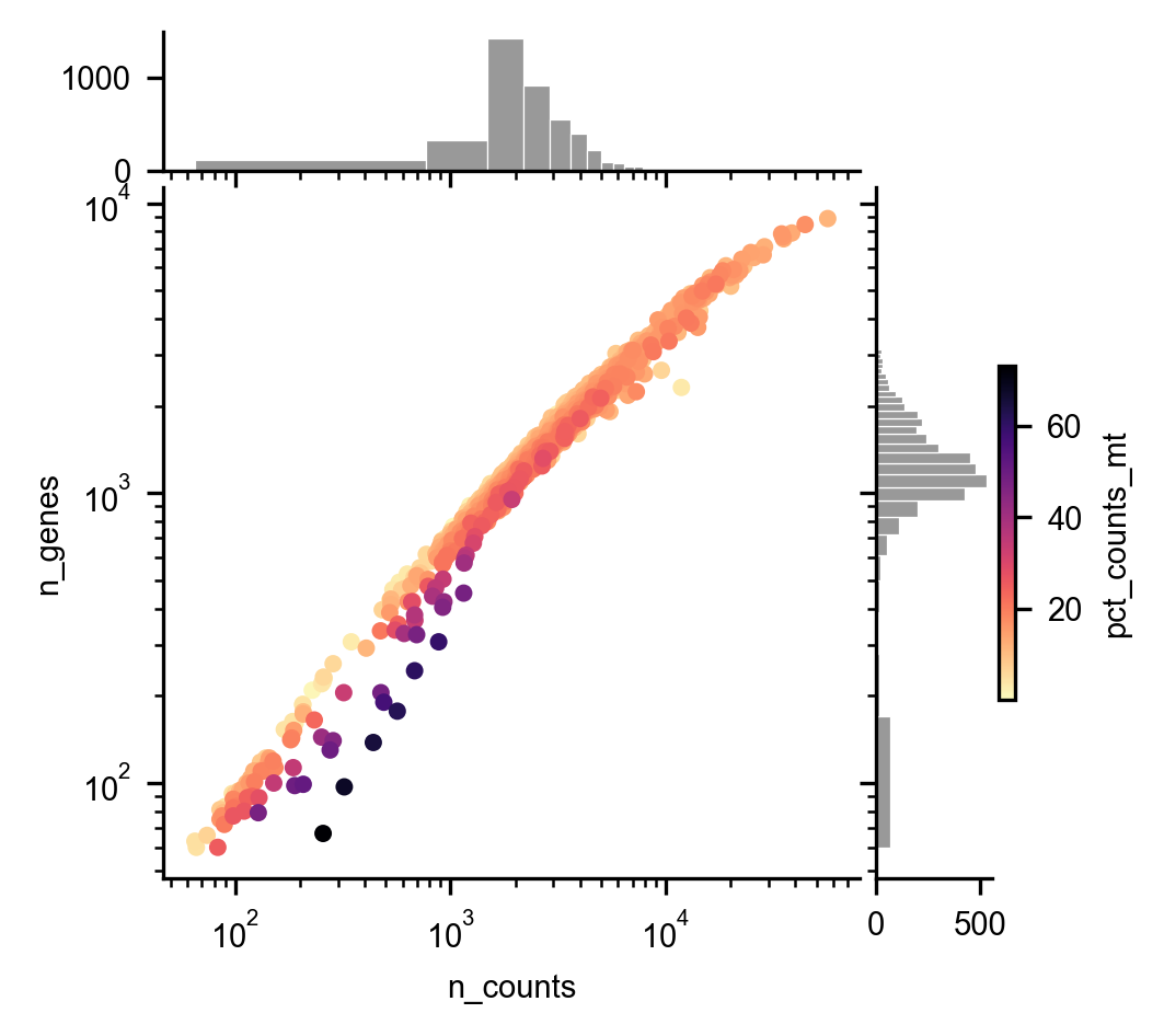
piaso.pl.violin(adata, ["n_counts", "n_genes", "pct_counts_mt", "pct_counts_ribo"])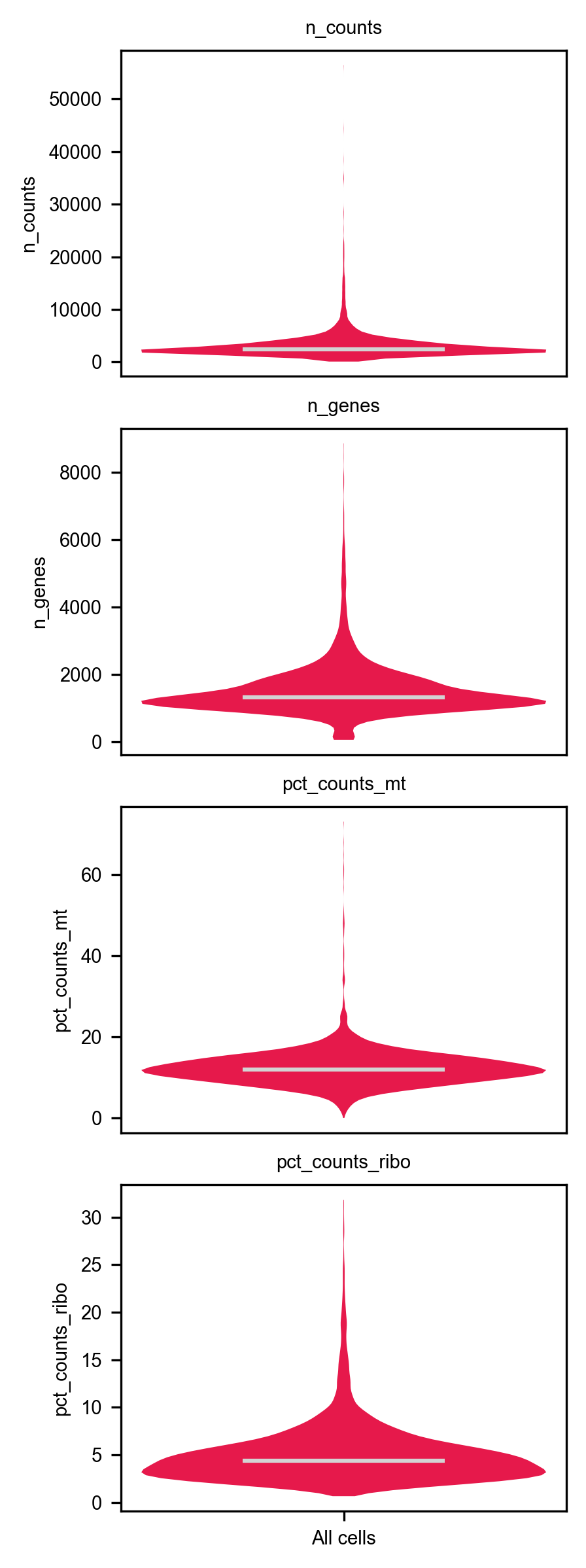
Both tails, not just the low one
Standard practice filters cells with too few counts. Too many counts is also a signal, and on this sample it is the one that matters: the barcode with 56,439 UMIs has 18× the median, and a barcode with far more RNA than its neighbours may be two cells in one droplet — though high counts also track genuine differences in cell size and cell type, which is why Scrublet below is an independent check rather than a confirmation.
Take the thresholds from the distribution rather than from habit:
hi_c = np.percentile(adata.obs["n_counts"], 99)      # 15,603mt_cut = np.percentile(adata.obs["pct_counts_mt"], 98)   # 21.4%ribo_cut = np.percentile(adata.obs["pct_counts_ribo"], 99)   # 19.1%
keep = ((adata.obs["n_counts"] >= 500)        & (adata.obs["n_counts"] <= hi_c)        & (adata.obs["n_genes"] >= 250)        & (adata.obs["pct_counts_mt"] <= mt_cut)        & (adata.obs["pct_counts_ribo"] <= ribo_cut))adata = adata[keep].copy()adata.shape
low counts 83high counts 44low genes 80high mt 88high ribo 44 (4360, 36601) -> (4154, 36601)A percentile is not a biological threshold. mt_cut is the 98th percentile
of this sample, which lands at 21.4% — far above the 5–10% usually quoted,
because the whole distribution sits high. A fixed 10% cut would have removed
about a third of the cells, most of them healthy. Read the distribution first.
piaso.pp.scrublet(adata, expected_doublet_rate=0.06, random_state=0)adata.obs["is_doublet"].sum()74 # 1.8%3. Cluster, then look at the clusters
Save the raw counts before you normalise. piaso.tl.infog writes its
result to adata.layers["infog"] and leaves adata.X alone, so nothing here
destroys the UMIs — but nothing guarantees they survive either. One
sc.pp.normalize_total later, in this notebook or the next one, overwrites
X in place and they are gone for good. The line costs a copy and buys back
every count-based analysis: differential expression, pseudobulk, re-normalising
with different parameters, and writing an .h5ad a collaborator can still use.
adata.layers["counts"] = adata.X.copy()          # the raw UMIs, keptpiaso.tl.infog(adata, n_top_genes=3000)piaso.tl.runSVD(adata, layer="infog", n_components=50, key_added="X_svd")piaso.tl.neighbors(adata, use_rep="X_svd", n_neighbors=15)piaso.tl.leiden(adata, resolution=1.0, key_added="leiden")piaso.tl.umap(adata, use_rep="X_svd")
piaso.pl.embedding(adata, basis="X_umap", color="leiden")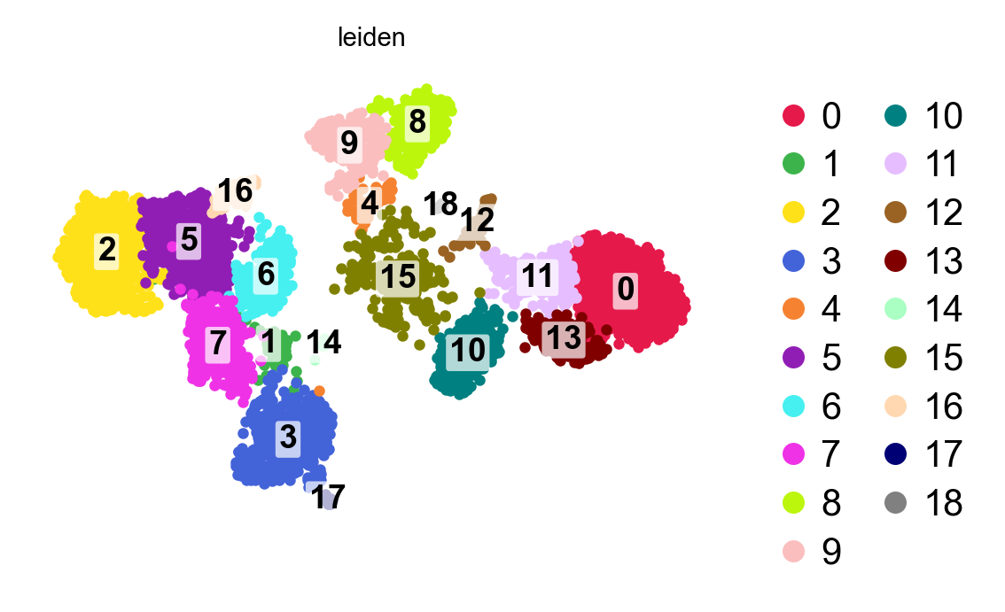
19 clusters. Before naming any of them, put the QC metrics on the same UMAP:
piaso.pl.embedding(adata, basis="X_umap", color=["n_counts", "n_genes", "pct_counts_mt", "pct_counts_ribo", "scrublet_score"], cmap="Spectral_r", ncol=3)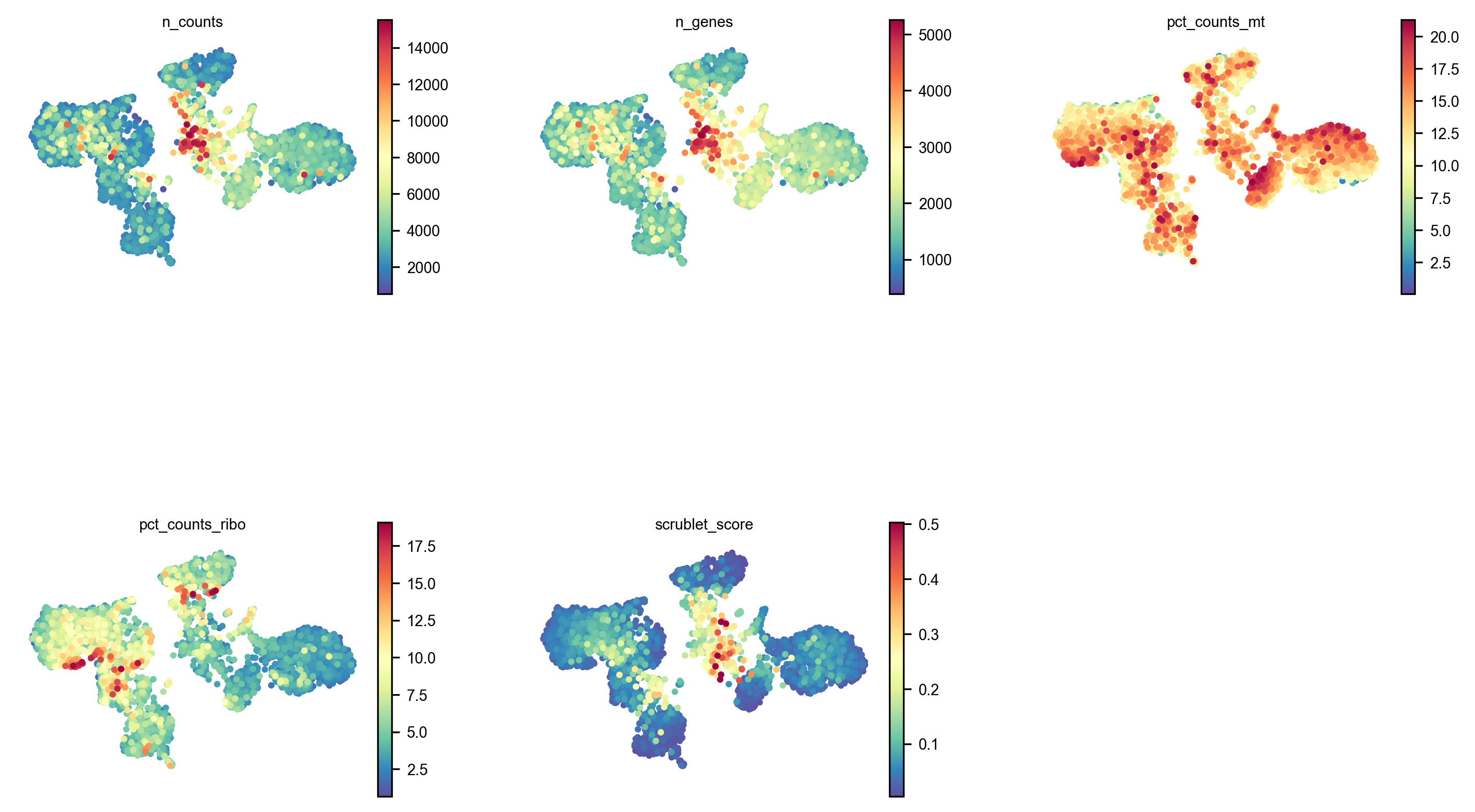
4. Which clusters are artefacts
Run COSG first: a cluster’s markers are the most informative QC metric it has, and no summary statistic replaces them.
cosg.cosg(adata, groupby="leiden", key_added="cosg", n_genes_user=25, layer="infog")names = pd.DataFrame(adata.uns["cosg"]["names"])scores = pd.DataFrame(adata.uns["cosg"]["scores"])qc = adata.obs.groupby("leiden", observed=True).agg( n_cells=("n_genes", "size"), median_genes=("n_genes", "median"), median_pct_mt=("pct_counts_mt", "median"), median_scrublet=("scrublet_score", "median"), frac_high_scrublet=("scrublet_score", lambda v: float((v > 0.2).mean())))qc["top_cosg"] = [float(scores[c].iloc[0]) for c in qc.index]
# the check that matters: are the markers themselves mitochondrial?qc["mt_in_top10"] = [sum(g.startswith("MT-") for g in names[c].head(10)) for c in qc.index]qc["top5"] = [", ".join(names[c].head(5)) for c in qc.index]qc.sort_values("median_pct_mt", ascending=False)| leiden | n | median mt% | top COSG | MT in top 10 | scrublet > 0.2 | top markers |
|---|---|---|---|---|---|---|
| 10 | 223 | 15.2 | 0.682 | 0 | 1% | TCF7L2, CDKN1C, FCGR3A |
| 12 | 45 | 14.2 | 0.679 | 0 | 2% | FCER1A, CD1C, CLEC10A |
| 15 | 246 | 13.2 | 0.028 | 5 | 60% | MTRNR2L12, APBB3, MT-ND1, MT-CO1 |
| 0 | 691 | 13.1 | 0.643 | 0 | 0% | NAMPT, VCAN, FCAR, CXCL8 |
| 1 | 60 | 11.8 | 0.036 | 0 | 40% | SEMA4C, DTX3, CENPV |
| 4 | 73 | 11.3 | 0.019 | 0 | 41% | C1QTNF3, LIX1, CELSR1 |
| 3 | 403 | 11.4 | 0.624 | 0 | 0% | SPON2, PRF1, GNLY, KLRF1 |
Three clusters fail, and the median mitochondrial percentage identifies none of them. Cluster 15 has 13.2% — cluster 10 has 15.2% and is a perfectly good non-classical monocyte population (TCF7L2, CDKN1C, FCGR3A). Ranking by mt% puts the healthy cluster first.
What separates them is the last two columns:
- Cluster 15 is mitochondrial. Five of its ten best markers are MT genes, its single best marker scores 0.028 where healthy clusters score 0.6–0.7, and MTRNR2L12 — a mitochondrially-derived transcript — tops the list. A cluster whose defining feature is its mitochondrial content is dying cells, and no cell type is called “MT-ND1-positive”.
- Clusters 1 and 4 are doublets. Normal gene counts, ~40% of cells above the scrublet threshold, top markers scoring 0.02–0.04. They have no identity because they are mixtures of two.
lo, hi = qc["median_genes"].quantile([0.25, 0.75])qc["genes_z"] = (qc["median_genes"] - qc["median_genes"].median()) / (hi - lo)
drop = qc.index[(qc["median_scrublet"] > 0.15)                | (qc["frac_high_scrublet"] > 0.5)                | (qc["mt_in_top10"] >= 3)               # ambient / dying                | ((qc["genes_z"] < -1.5)                   & (qc["top_cosg"] < qc["top_cosg"].quantile(0.1)))]adata = adata[~adata.obs["leiden"].isin(drop)].copy()
DROP: ['1', '4', '15']Prefer two signals; require them where one would be ambiguous. Read the rule above carefully: three of its four clauses fire on their own, and only the last is a pair. That is deliberate rather than sloppy, and the difference is what each statistic means when it is extreme.
A median Scrublet score above 0.15 across a whole cluster, or more than half its cells scoring high, is already a joint statement about many cells — a single cell with a high doublet score is noise, a cluster of them is not. Likewise three or more mitochondrial genes in a cluster’s top ten is a composition statement, not a single threshold.
The last clause is the one that needs a partner, because a low gene count on its own flags real biology — plasmacytoid dendritic cells have few genes — so it only counts when the cluster also has no specific marker:
(qc["genes_z"] < -1.5) & (qc["top_cosg"] < qc["top_cosg"].quantile(0.1))A cluster with a low gene count and a 0.94-scoring marker is a cell type. A cluster with a normal gene count and no marker above 0.04 is not. The principle to carry away is not “always two rules” but never let a single cell-level statistic decide on its own — aggregate it over the cluster, or pair it with a specificity check.
5. Re-embed on what is left
The gene selection and the SVD were fitted with the removed cells in the object, so redo them:
piaso.tl.infog(adata, n_top_genes=3000)piaso.tl.runSVD(adata, layer="infog", n_components=50, key_added="X_svd")piaso.tl.neighbors(adata, use_rep="X_svd", n_neighbors=15)piaso.tl.leiden(adata, resolution=1.0, key_added="leiden")piaso.tl.umap(adata, use_rep="X_svd")
piaso.pl.embedding(adata, basis="X_umap", color="leiden")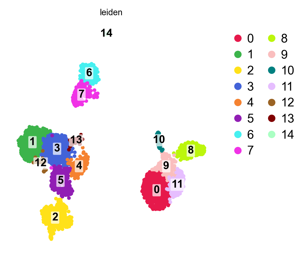
cosg.cosg(adata, groupby="leiden", key_added="cosg", n_genes_user=25,          layer="infog")names = pd.DataFrame(adata.uns["cosg"]["names"])top_per_cluster = [names[c].iloc[0] for c in names.columns][:12]
piaso.pl.violin(adata, top_per_cluster, groupby="leiden", layer="infog")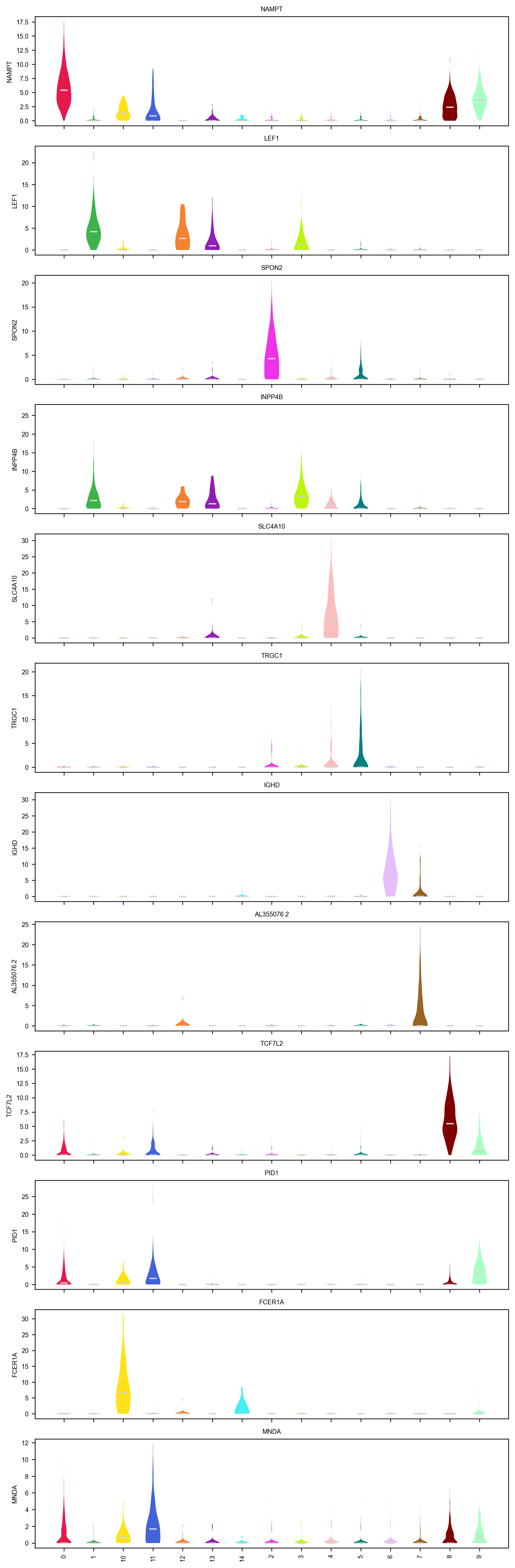
6. Names, from a reference
PBMC is the best-annotated tissue there is, so annotate against a curated
reference rather than by eye. AllenHumanImmuneHealthAtlas_L2 is in
PIASOmarkerDB.
marker_sets = piaso.tl.getMarkers(    study="AllenHumanImmuneHealthAtlas_L2", as_dict=True)
piaso.tl.predictCellTypeByMarker(adata, marker_gene_set=marker_sets,                                 score_layer="infog", use_rep="X_svd",                                 key_added="CellTypes")
getMarkers(as_dict=True) returns the dictionary itself — the form
predictCellTypeByMarker takes. Pass as_dict=False for the marker table.
The cluster-wise route asks a different question, and both are worth having:
rows = []for c in names.columns:    best = piaso.tl.analyzeMarkers(list(names[c])).iloc[0]    rows.append(dict(leiden=c, call=best["cell_type"],                     study=best["study_publication"]))calls = pd.DataFrame(rows)adata.obs["cluster_call"] = adata.obs["leiden"].map(    dict(zip(calls.leiden, calls.call)))
piaso.pl.embedding(adata, basis="X_umap", color=["CellTypes", "cluster_call"], ncol=1)
piaso.pl.plotConfusionMatrix(adata, "cluster_call", "CellTypes")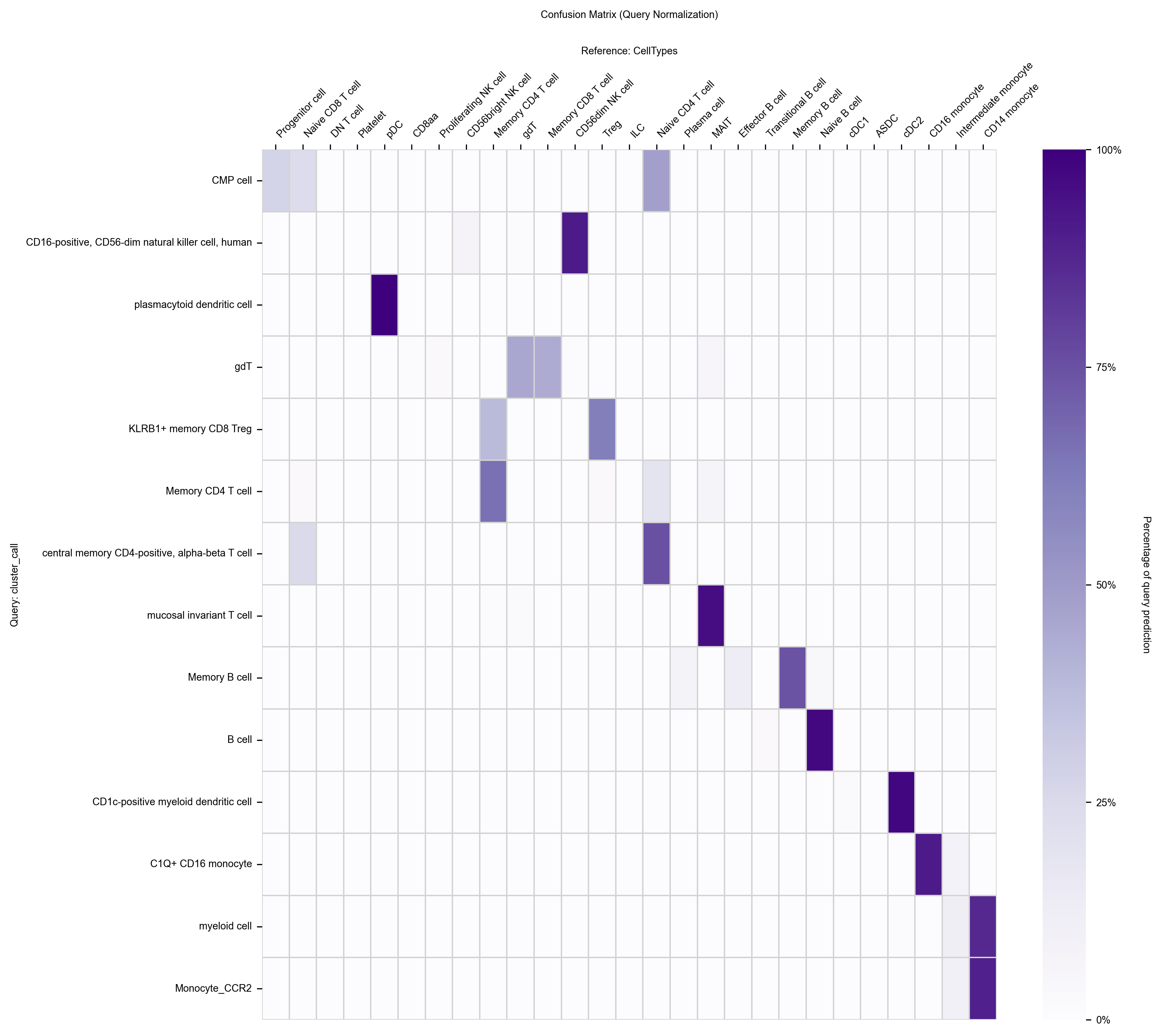
# Cluster numbers and cell type names share no vocabulary, so neither axis can# inherit an order from the other. "auto" puts each cell type at the mean# position of the clusters that map to it.piaso.pl.sankey(adata, left="leiden", right="CellTypes", right_order="auto")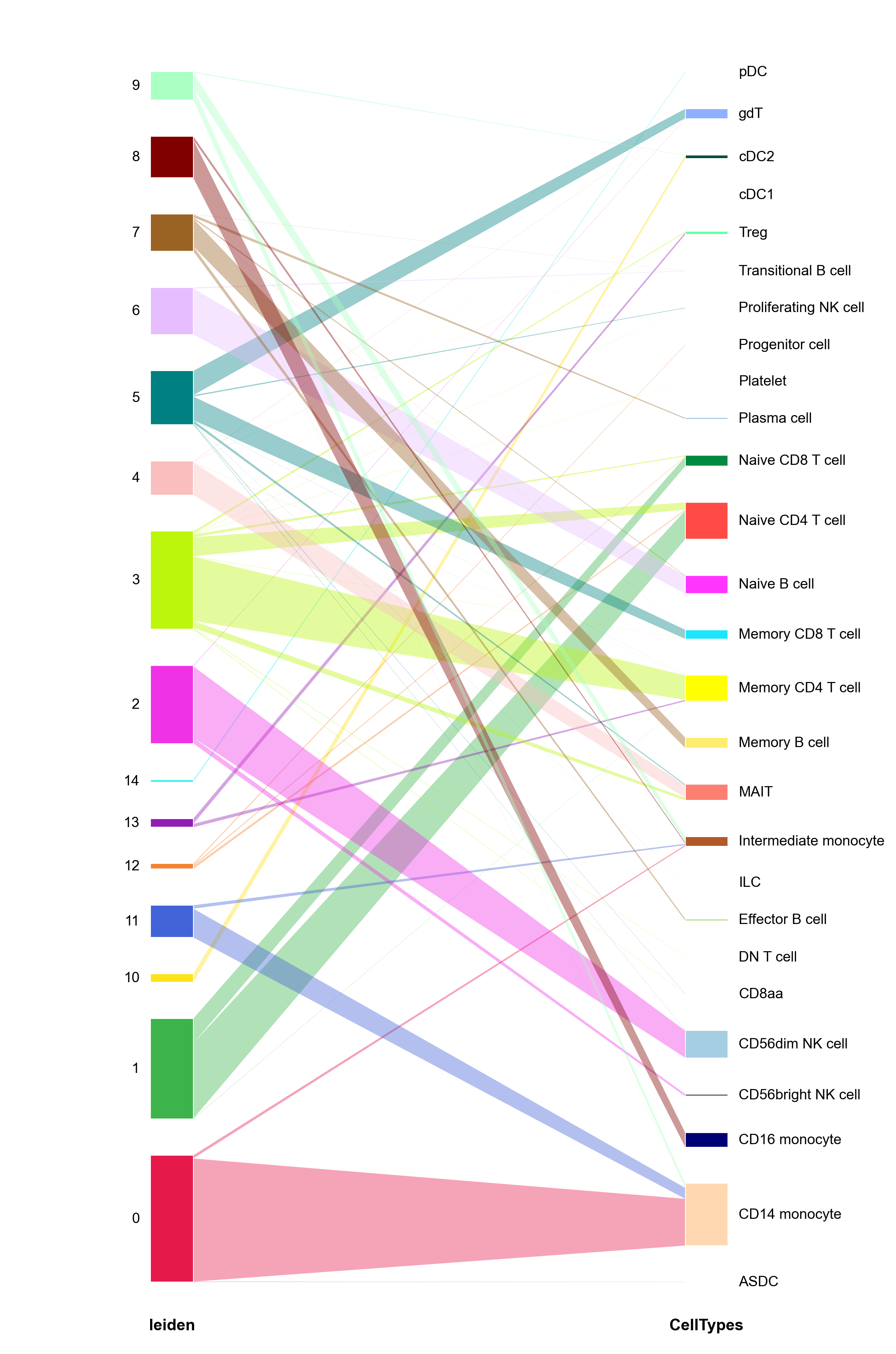
The Sankey answers the question a confusion matrix does not: which clusters split. A cluster whose ribbon fans into three labels is either over-clustered or genuinely heterogeneous, and either way it is the one to look at next.
piaso.pl.stackedBarplot(adata, groupby="CellTypes", splitby="leiden")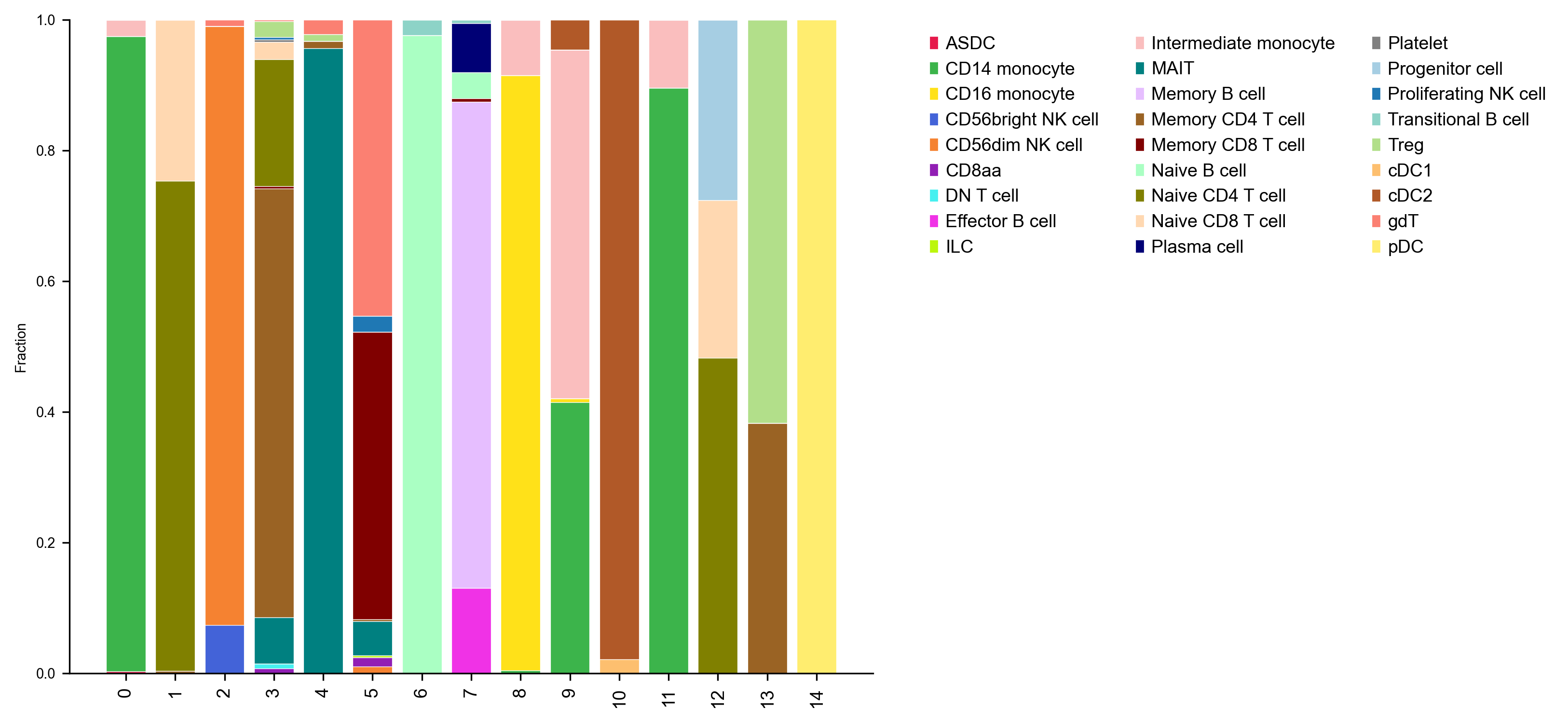
piaso.pl.dotplot(adata, top_per_cluster, groupby="CellTypes", layer="infog")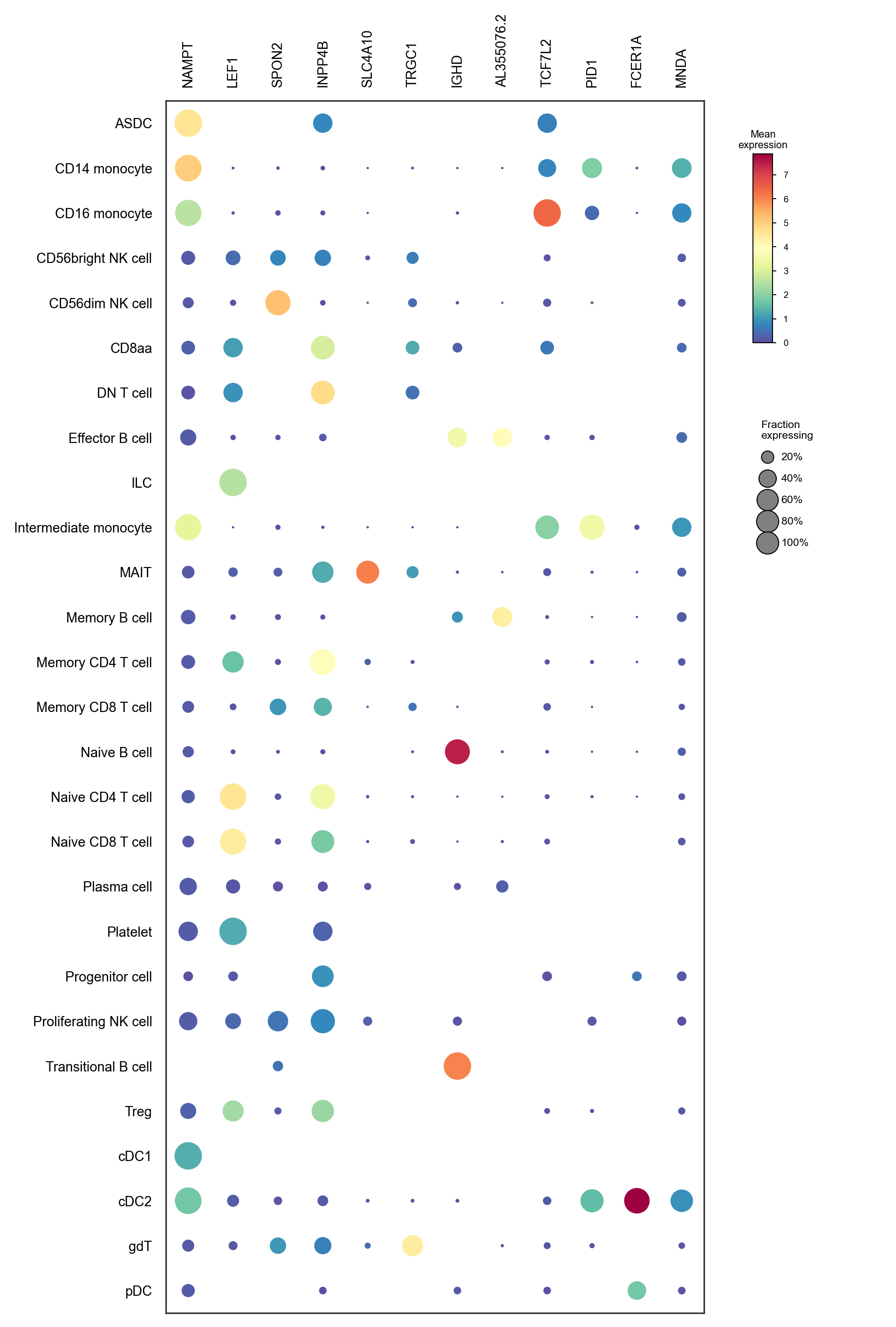
7. QC the annotation, not just the cells
Once cells have type labels, run the QC metrics again by type. It is the last chance to catch a label that is an artefact.
gm = piaso.pp.calculateGroupMetrics(adata, groupby="CellTypes")piaso.pl.plotGroupMetrics(gm, data=adata, groupby="CellTypes")
A cell type that stands alone on total counts or mitochondrial fraction —
rather than sitting inside the spread — is a type that was called on a
technical gradient. calculateGroupMetrics produces the table;
plotGroupMetrics renders it.
8. GDR, unsupervised by default
The SVD embedding was built from 3,000 genes chosen by variance. GDR rebuilds it from genes that distinguish groups of cells instead — and, as the note below explains, it is better to let it find those groups itself than to hand it the annotation from §6:
piaso.tl.runGDR(adata, batch_key=None, groupby=None,                n_gene=20, mu=10, layer="infog", score_layer="infog")
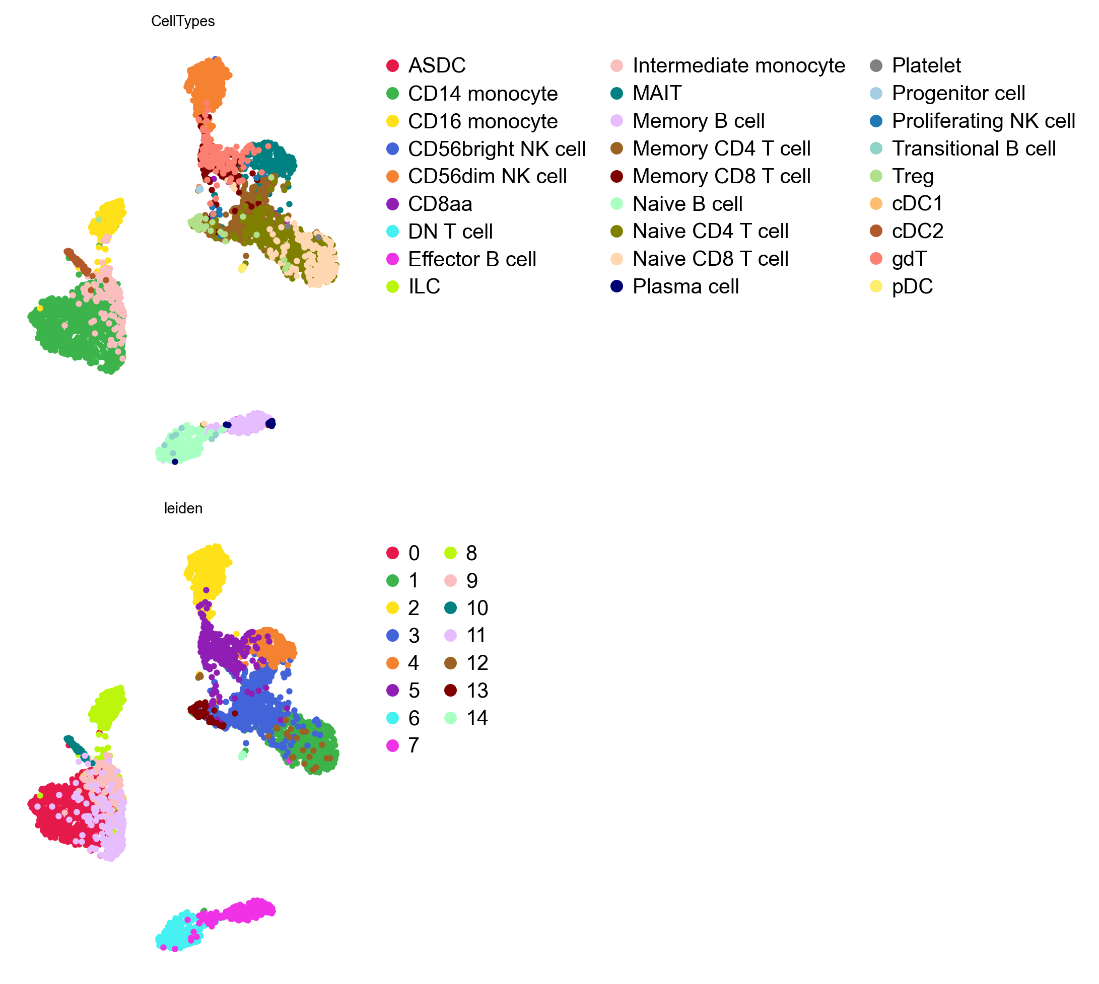
piaso.tl.neighbors(adata, use_rep="X_gdr", n_neighbors=15)piaso.tl.umap(adata, use_rep="X_gdr", key_added="X_umap_gdr")piaso.pl.embedding(adata, basis="X_umap_gdr", color=["CellTypes", "leiden"],                   ncol=1)
groupby=None is the honest default. It makes GDR unsupervised: it does its
own clustering, takes marker genes from that, and builds the embedding — no
labels required. Passing groupby="CellTypes" instead would hand GDR the
annotation from §6 and then show that the result separates those same cell
types, which is close to circular. Unsupervised is also what you actually have
on a new dataset, before anything is named.
ncol=1 stacks the two panels. They do fit side by side — a multi-panel
figure is widened to fit its legends — but with 27 cell types beside 15 clusters
the two legends are very different widths, and stacking keeps both panels the
same size and the page narrow.
batch_key=None because this is one sample. With several, pass the sample
column and GDR computes marker genes per batch: that is the
multi-sample tutorial.
n_gene=20 per group rather than 30: fewer, more specific genes per cluster.
On a sample this size 30 starts pulling in genes that are shared between related
T-cell clusters, which blurs exactly the distinctions the embedding is for.
What this sample teaches that the mouse one cannot
| mouse brain nuclei | human PBMC (SAN2) | |
|---|---|---|
median pct_counts_mt | 0.011% | 12.0% |
| a mitochondrial cluster | none exists | cluster 15, 5 MT genes in its top 10 |
| useful mt threshold | none — it removes 27 cells | the 98th percentile, 21.4% |
| what finds bad clusters | doublet scores | doublet scores and marker identity |
The transferable rule is the one in §4: rank clusters by whether their markers make sense, not by their QC statistics. On the mouse sample the highest-mitochondrial cluster is endothelium and should be kept. Here, the third-highest is dying cells and should go. Only the markers tell them apart.
Next
- Human PBMC scRNA-seq end to end (cytome): the same analysis, on disk.
- GDR: what the embedding in §8 is doing.
- PIASOmarkerDB API client: the reference used in §6.