
Plotting functions
Plotting functions in PIASO
This notebook will demonstrate the different plotting functions and their application to sample data.
import piasoimport piasoimport numpy as npimport matplotlib.pyplot as pltpiaso.settings.set_figure_params(style="cell")Every plot on this page is a piaso.pl call. set_figure_params fixes the
figure size, font and the rest of the house style, so the rcParams block that
used to follow it is unnecessary — and scanpy is not imported, because nothing
here needs it.
style="cell"targets Cell’s single-column figure spec: 7 pt type on a 3.35-inch (85 mm) canvas. That is why titles and legends look small when you draw atfigsize=(16, 8)— the type stays 7 pt while the canvas grows. Either draw at the size the style is for, or passfontsize=toset_figure_paramswhen you deliberately want a larger figure.
warnings.simplefilter(action='ignore', category=FutureWarning)Load the data
Let us load a 20k subsampled version of the Seattle Alzheimer’s Disease Brain Cell Atlas (SEA-AD) project dataset described in detail in Gabitto et. al. (2024). We will be using the scRNA-seq data from the dataset in this tutorial.
Download the subsampled dataset from Google Drive: https://drive.google.com/file/d/1EdRA0ECvPlEnNaOzKqj19GrEtucB7hmE/view?usp=drive_link
The original data is available on https://portal.brain-map.org/explore/seattle-alzheimers-disease.
adata = piaso.data.load_dataset("sea_ad_mtg_20k")adataVisualize with a discrete color map
The discrete color map can be used to visualize the categorical variables such as cell subclass.
piaso.pl.embedding(adata, basis='X_umap', color=['Subclass'], palette=piaso.pl.color.d_color3, legend_fontoutline=2)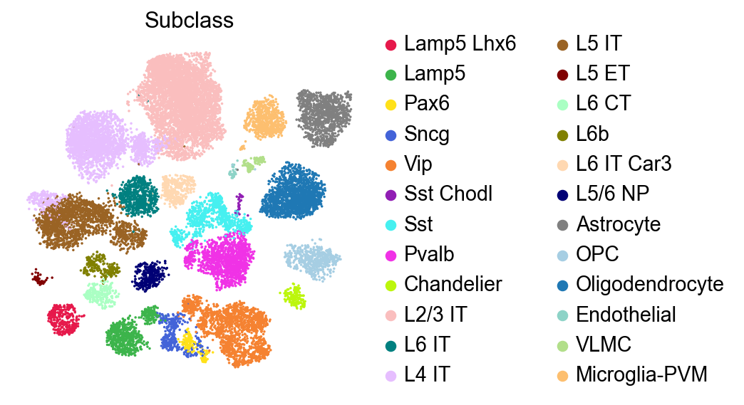
piaso.pl.embedding(adata, basis='X_umap', color=['Subclass'], palette=piaso.pl.color.d_color3, legend_fontoutline=2, legend_fontsize=7, legend_loc='on_data', legend_fontbackground='white')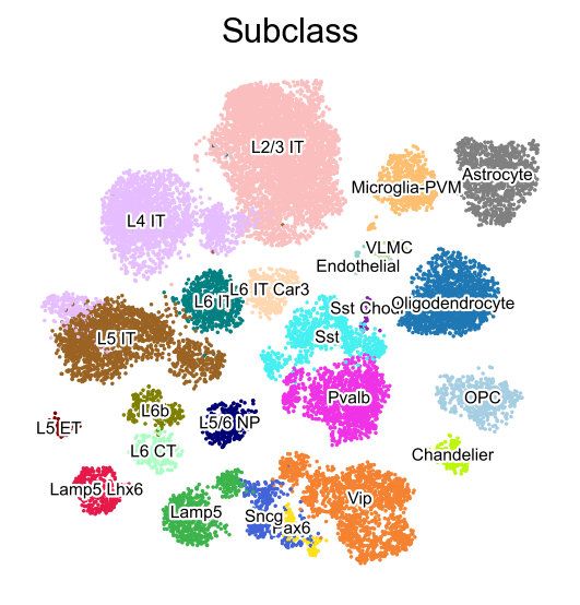
Visualize with a continuous color map
The continuous color map can be used to visualize the continuous variables such as gene expression.
piaso.pl.umap(adata, color=['GAD1', 'PVALB', 'SST', 'PDGFRA'], cmap=piaso.pl.color.c_color1, ncols=2)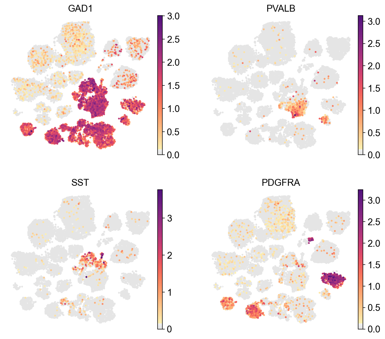
piaso.pl.umap(adata, color=['GAD1', 'PVALB', 'SST', 'PDGFRA'], cmap=piaso.pl.color.c_color4, ncols=2)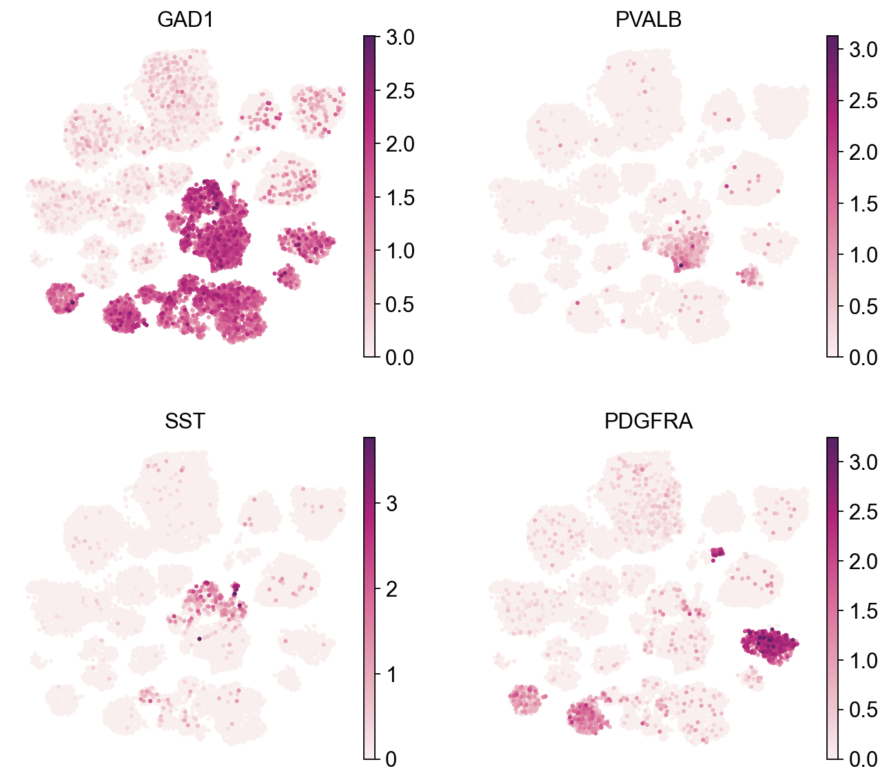
Split the UMAP by condition
mapping_dict=dict(zip(adata.obs['CERAD score'], adata.obs['CERAD score']))mapping_dict={'Absent': 'Absent', 'Sparse': 'Disease', 'Moderate': 'Disease', 'Frequent': 'Disease'}adata.obs['Condition']=adata.obs['CERAD score'].map(mapping_dict)piaso.pl.embedding(adata, basis='X_umap', color=['Condition'], palette=piaso.pl.color.d_color1, legend_fontoutline=2)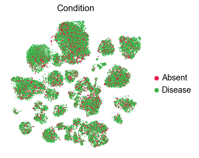
Visualizing the expression of a specific gene across two different experimental conditions
piaso.pl.plot_embeddings_split(adata, color='ADGRG7', layer=None, splitby='Condition', color_map=piaso.pl.color.c_color1, size=100, frameon=False, legend_loc=None,)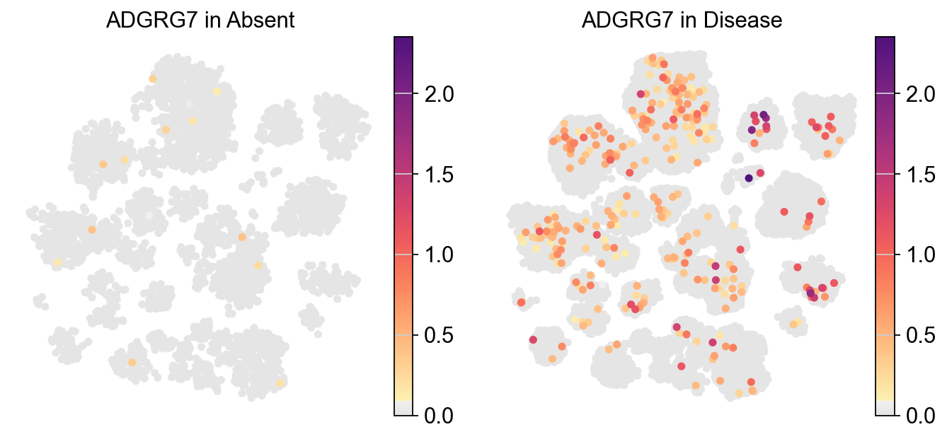
piaso.pl.plot_embeddings_split(adata, color='FEZF2', layer=None, splitby='Condition', color_map=piaso.pl.color.c_color1, size=100, frameon=False, legend_loc=None,)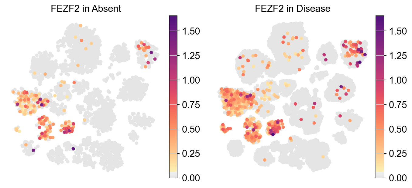
Visulaizing continuous variables (Number of UMIs) across different experimental conditions
piaso.pl.plot_embeddings_split(adata, color='Number of UMIs', layer=None, splitby='Condition', color_map=piaso.pl.color.c_color4, size=100, frameon=False, legend_loc=None)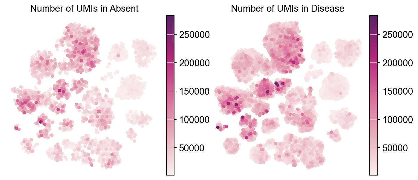
Visualizing categorical variables (Cell subclass) across different experimental conditions
piaso.pl.plot_embeddings_split(adata, color='Subclass', layer=None, splitby='Condition', size=100, frameon=False,)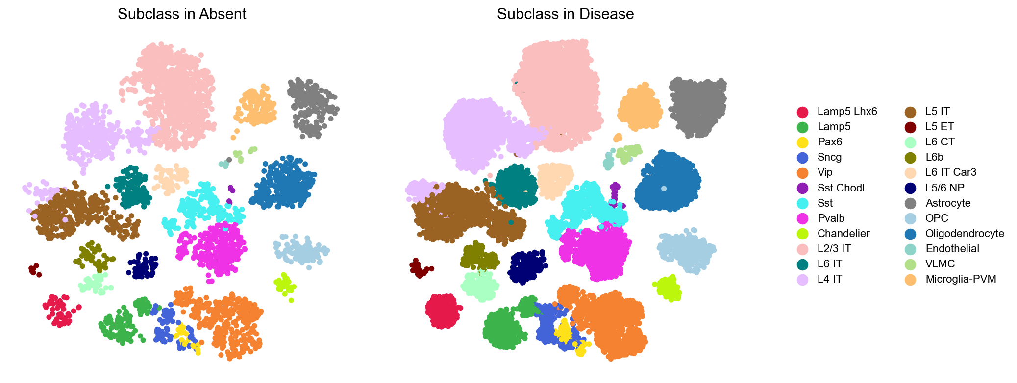
We can visualize these cell subclasses alongside the subclass legend. To enhance clarity, the ncol parameter can be used to adjust the number of subplots per row.
piaso.pl.plot_embeddings_split(adata, color='Subclass', layer=None, splitby='Condition', size=100, frameon=False, ncol=1)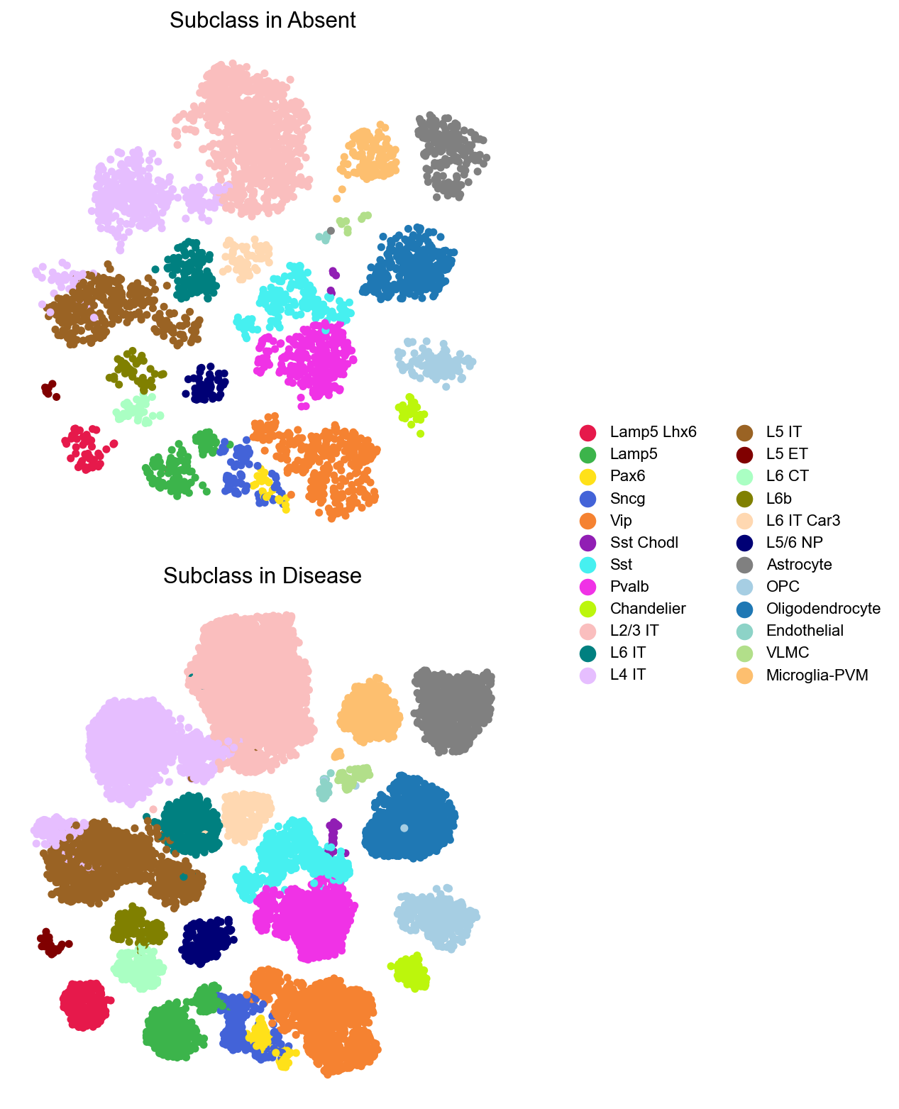
piaso.pl.plot_embeddings_split(adata, color='Subclass', layer=None, splitby='Condition', size=100, frameon=False, legend_fontsize=7, legend_fontoutline=2, legend_fontweight=5, legend_loc='on data')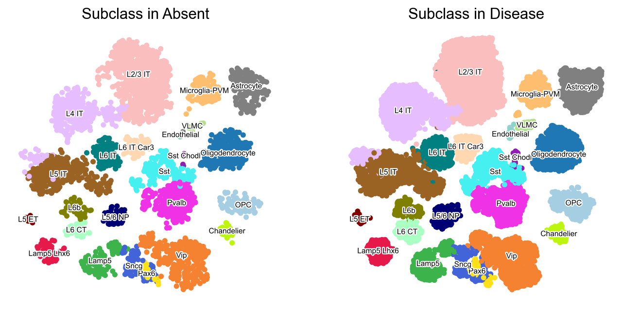
Violin plots of grouped data
Visulaize how the groups in the dataset vary across a list of different features. Here, you can plot a different subplot for each feature of interest.
piaso.pl.plot_features_violin(adata, feature_list=[ 'CALB2', 'GAD2', 'SATB2', 'TBR1', 'Number of UMIs'], width_single=8, height_single=2.3, groupby='Subclass', show_grid=False)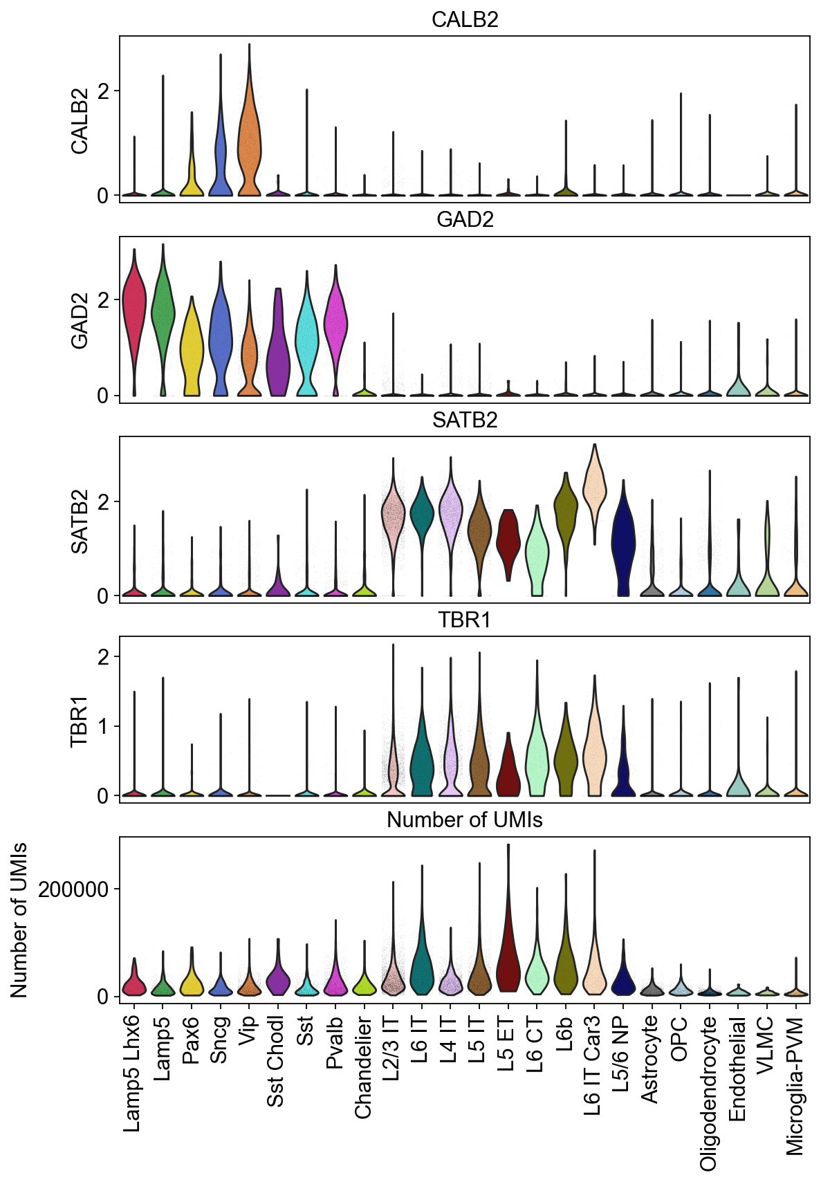
Adding the horizontal grid line
piaso.pl.plot_features_violin(adata, feature_list=[ 'CALB2', 'GAD2', 'SATB2', 'TBR1', 'Number of UMIs'], width_single=8, height_single=2.3, groupby='Subclass')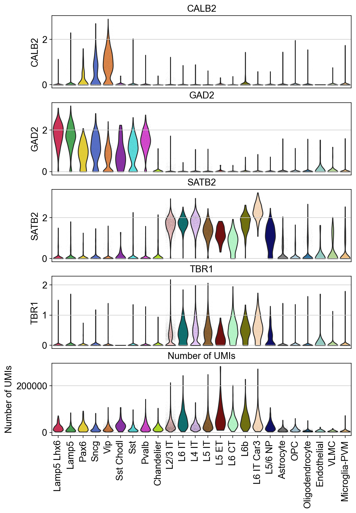
The height and widhts of these plots can be adjusted according to the number of features and groups you have for better visualization.
piaso.pl.plot_features_violin(adata, feature_list=[ 'CALB2', 'GAD2', 'SATB2', 'TBR1', 'Number of UMIs'], width_single=20, height_single=3, groupby='Subclass', show_grid=False)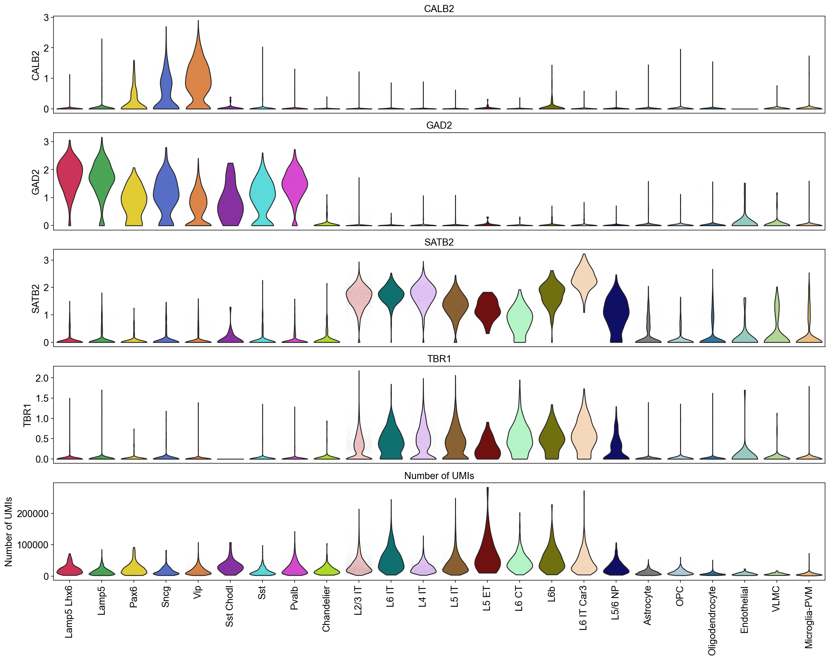
Violin plots of entire data
We can visualize the entire dataset as a single group, adjusting the dot size to plot all the cells onto the violin plot.
piaso.pl.plot_features_violin(adata, feature_list=[ 'Genes detected'], width_single=4, height_single=2.0, size=1)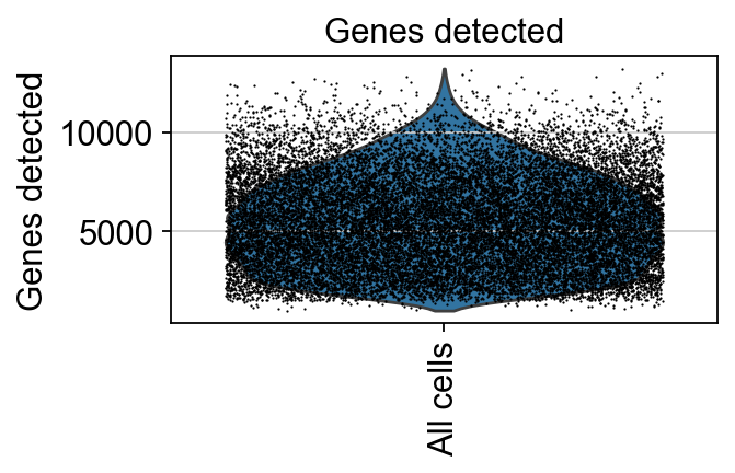
We can visualize the distributions of the cells across various features together.
piaso.pl.plot_features_violin(adata, feature_list=[ 'MALAT1', 'GAD2', 'Number of UMIs'], width_single=4, height_single=2.3, size=0.5, show_grid=False)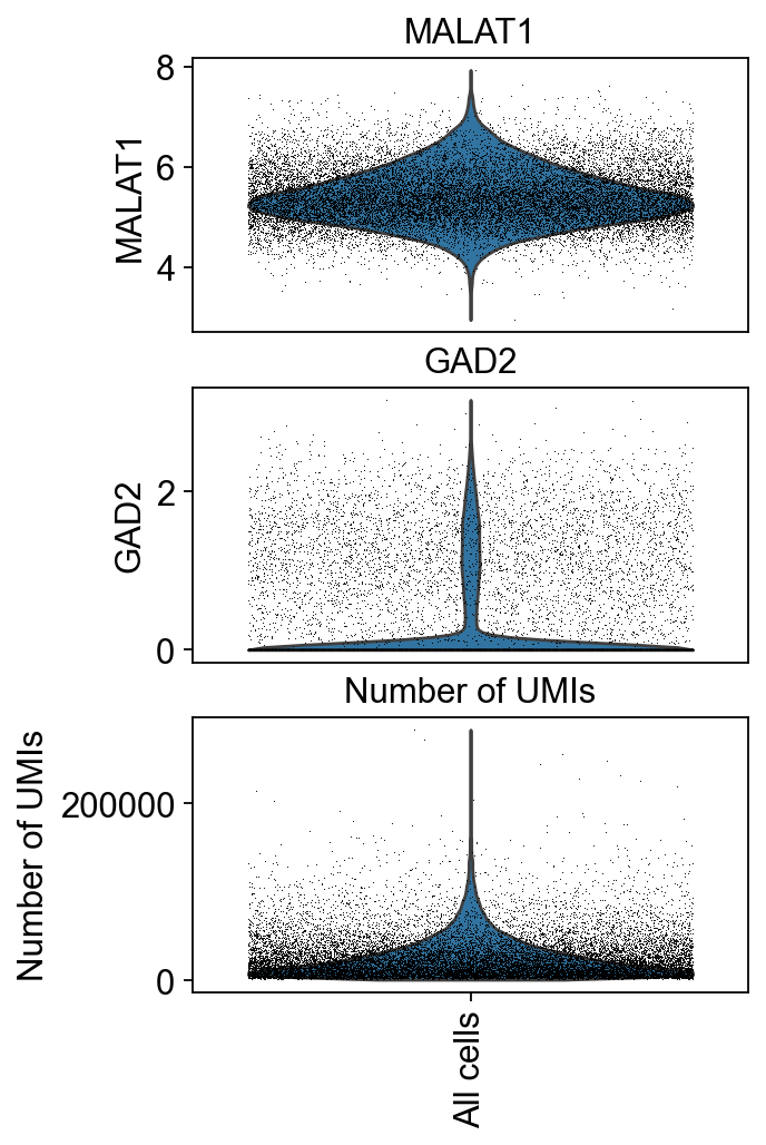
Save output plots
Use the save parameter to specific the file name and path to save:
piaso.pl.plot_embeddings_split(adata, color='ADGRG7', layer=None, splitby='Condition', color_map=piaso.pl.color.c_color1, size=100, frameon=False, legend_loc=None, save='./PIASO_UMAP_split_by_condition.pdf')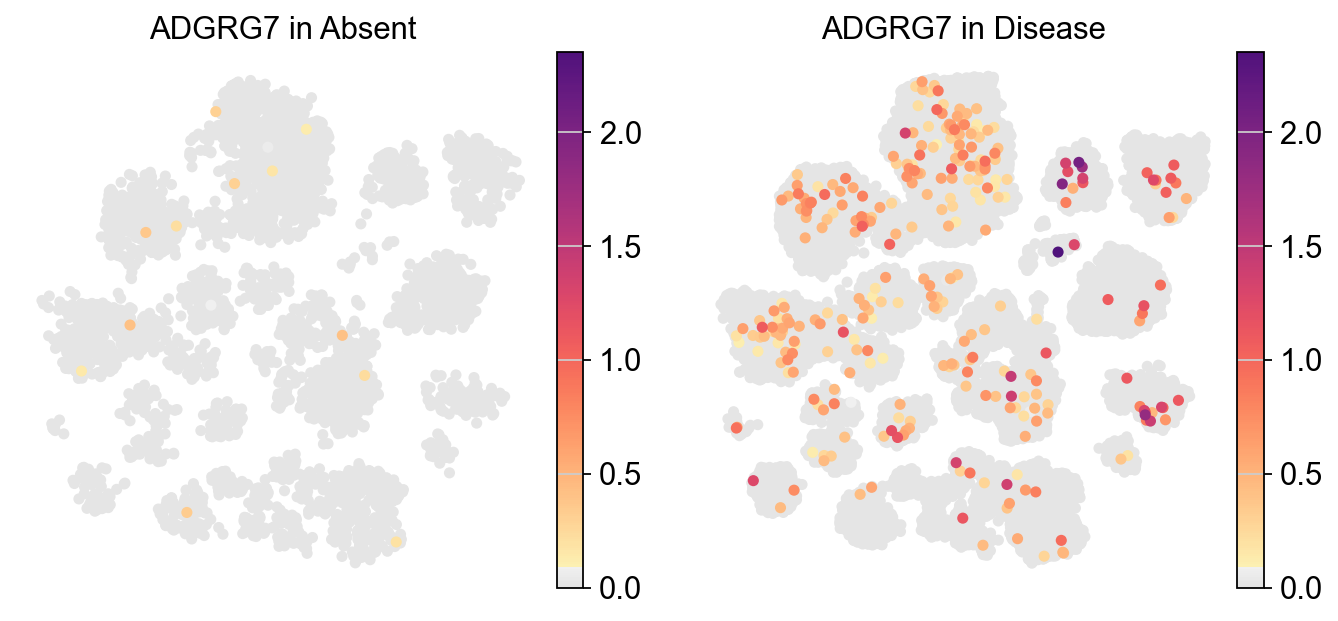
piaso.pl.plot_features_violin(adata, feature_list=[ 'CALB2', 'GAD2', 'SATB2', 'TBR1', 'Number of UMIs'], width_single=8, height_single=2.3, groupby='Subclass', show_grid=False, save='./violin_plot_piaso.pdf')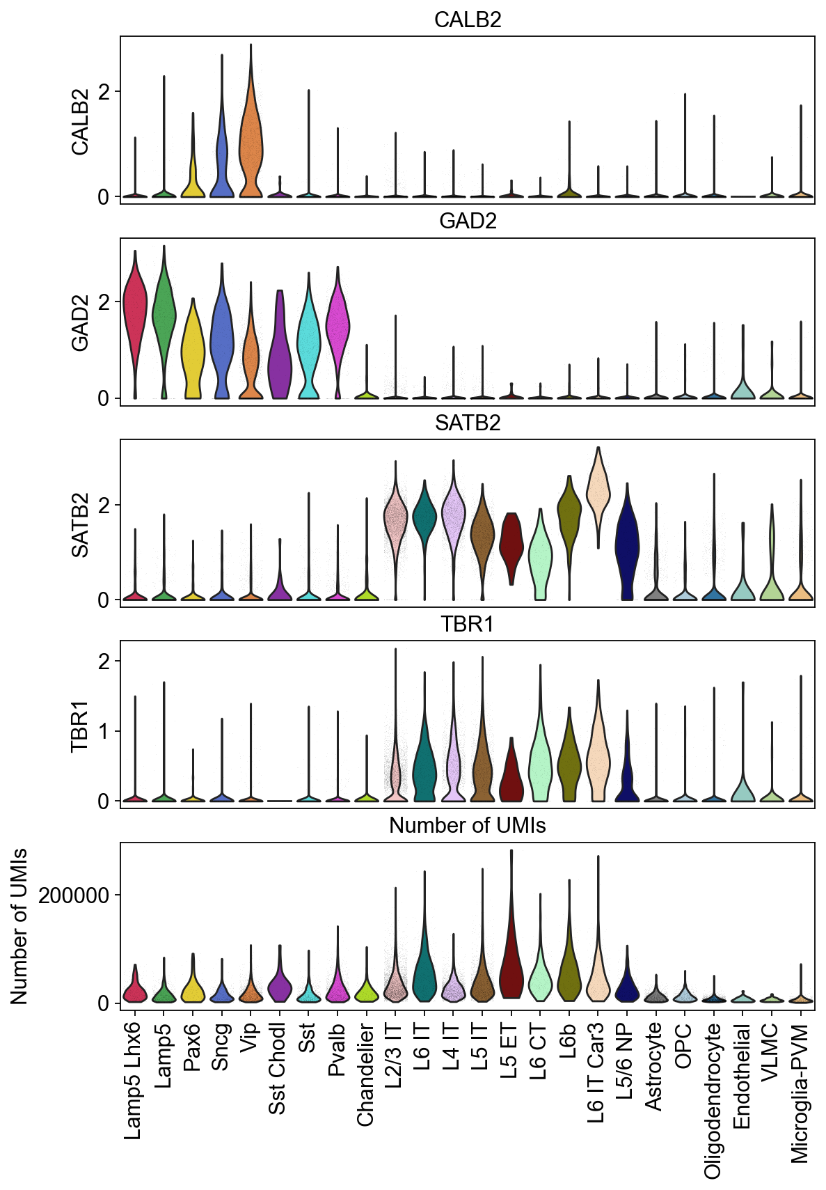
Combine categorical variables
mapping_dict={'Absent': 'Control', 'Sparse': 'Disease', 'Moderate': 'Disease', 'Frequent': 'Disease'}adata.obs['Condition']=adata.obs['CERAD score'].map(mapping_dict)adata.obs['SubclassXCondition'] = piaso.pp.getCrossCategories(adata.obs, 'Subclass', 'Condition', )By combining multiple categories, while maintaining the original orders of the categories, you could show the gene expression changes at cell type level across different conditions.
piaso.pl.dotplot( adata, features=['SERPINE1'], groupby='SubclassXCondition', swap_axes=True, cmap=piaso.pl.color.c_color4)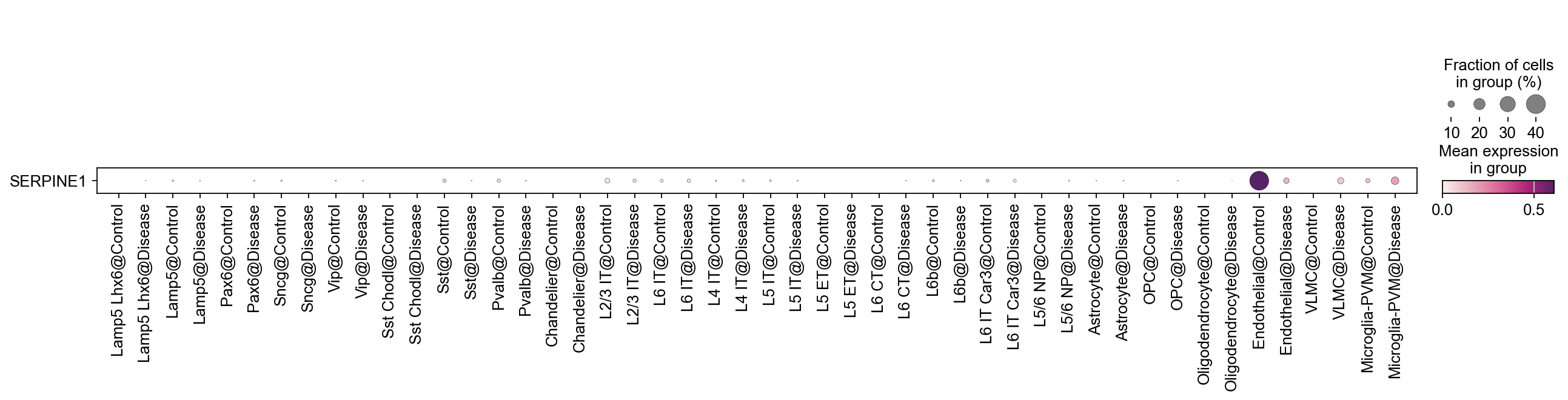
We can also switch the order in which we combine the categorical variables.
adata.obs['ConditionXSubclass'] = piaso.pp.getCrossCategories(adata.obs, 'Condition', 'Subclass',)piaso.pl.dotplot( adata, features=['SERPINE1'], groupby='ConditionXSubclass', swap_axes=True, cmap=piaso.pl.color.c_color4)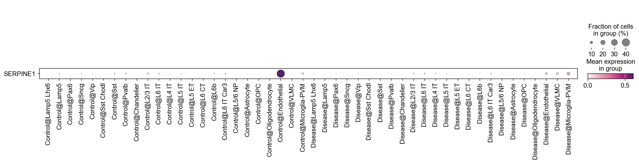
Count the number of cells in each category
piaso.pp.table(adata.obs['Subclass'])You can use the rank parameter to order the results, and the ascending parameter to determine the order of the ranking.
piaso.pp.table(adata.obs['Subclass'], rank = True, ascending = True)piaso.pp.table(adata.obs['Subclass'], rank = True, ascending = False)In order to store the results as a dataframe, set as_dataframe = True.
subclass_df = piaso.pp.table(adata.obs['Subclass'], rank = True, ascending = False, as_dataframe = True)Category order and colours
Legends and dot-plot rows follow the category order of the grouping column, and colours come with it. Both backends let you set these once and have every later plot honour them — the difference is where the setting lives.
AnnData: order lives in the categorical dtype, colours in
adata.uns['<column>_colors'] (one hex colour per category, in category
order):
subclass_order = ['Astro', 'Oligo', 'OPC', 'Micro', 'Endo']  # your orderadata.obs['Subclass'] = adata.obs['Subclass'].cat.reorder_categories(subclass_order)adata.uns['Subclass_colors'] = ['#4c72b0', '#dd8452', '#55a868', '#c44e52', '#8172b3']
piaso.pl.plotEmbedding(adata, color='Subclass')  # legend now uses your order + palette
Note these live in the Python object: they persist only if you write the AnnData back to disk afterwards.
Cytome: set_categories persists order and palette in the file, so
they apply in every later session without re-declaring them:
ds.set_categories(    'Subclass',    order=subclass_order,    colors=dict(zip(subclass_order,                    ['#4c72b0', '#dd8452', '#55a868', '#c44e52', '#8172b3'])),)
piaso.pl.plotEmbedding(ds, color='Subclass')  # same legend — today and next week
Set once, every plot afterwards honours it, including in a fresh session — the ordering travels with the data rather than with your script.